
SAVI
SAVI is a modern premium prepared-meal delivery brand for founders, freelancers, creatives and young professionals who want to eat well without cooking, meal prepping or settling for sad takeout.
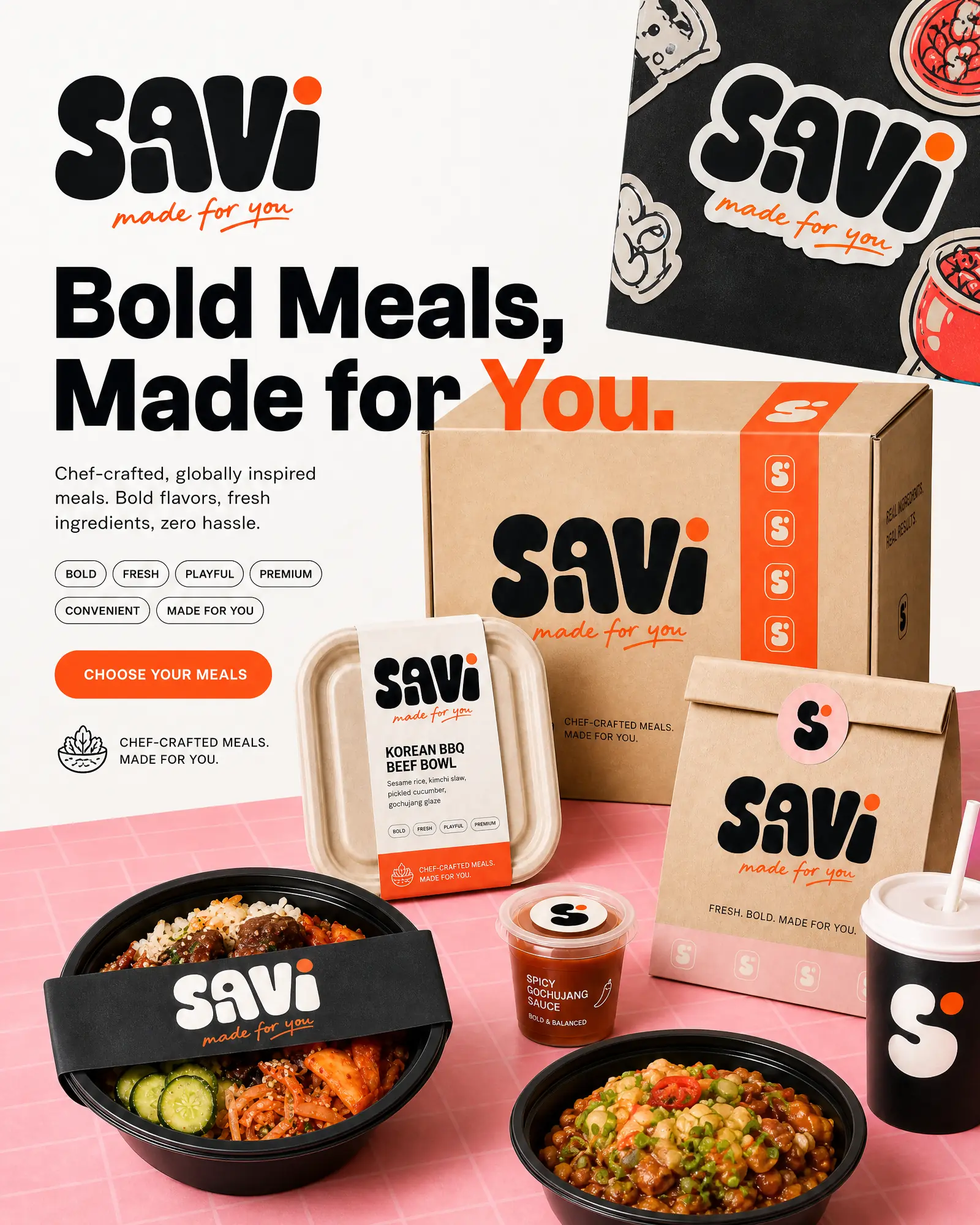
Brand Strategy · Identity · Packaging · Campaign · Social · Email · UGC
Prepared-meal brands often look clinical, fitness-led or interchangeable. SAVI needed to feel like a bold lifestyle brand first—fresh, culturally relevant and social-native—while still making convenience and quality instantly clear.
Brand story
Built for the in-between moments
For the founders between meetings. The freelancers between deadlines. The creatives between projects—people who want to eat well but don’t have time to cook, plan or settle for a sad desk lunch.
We believe fresh, chef-crafted food shouldn’t be a luxury or a chore. So we designed a delivery experience that fits real routines: bold, globally inspired meals, ready in minutes, with zero prep and zero guilt. No diet culture. No frozen trays. No compromise.
SAVI is food that keeps up with youMade for you. Delivered to you.
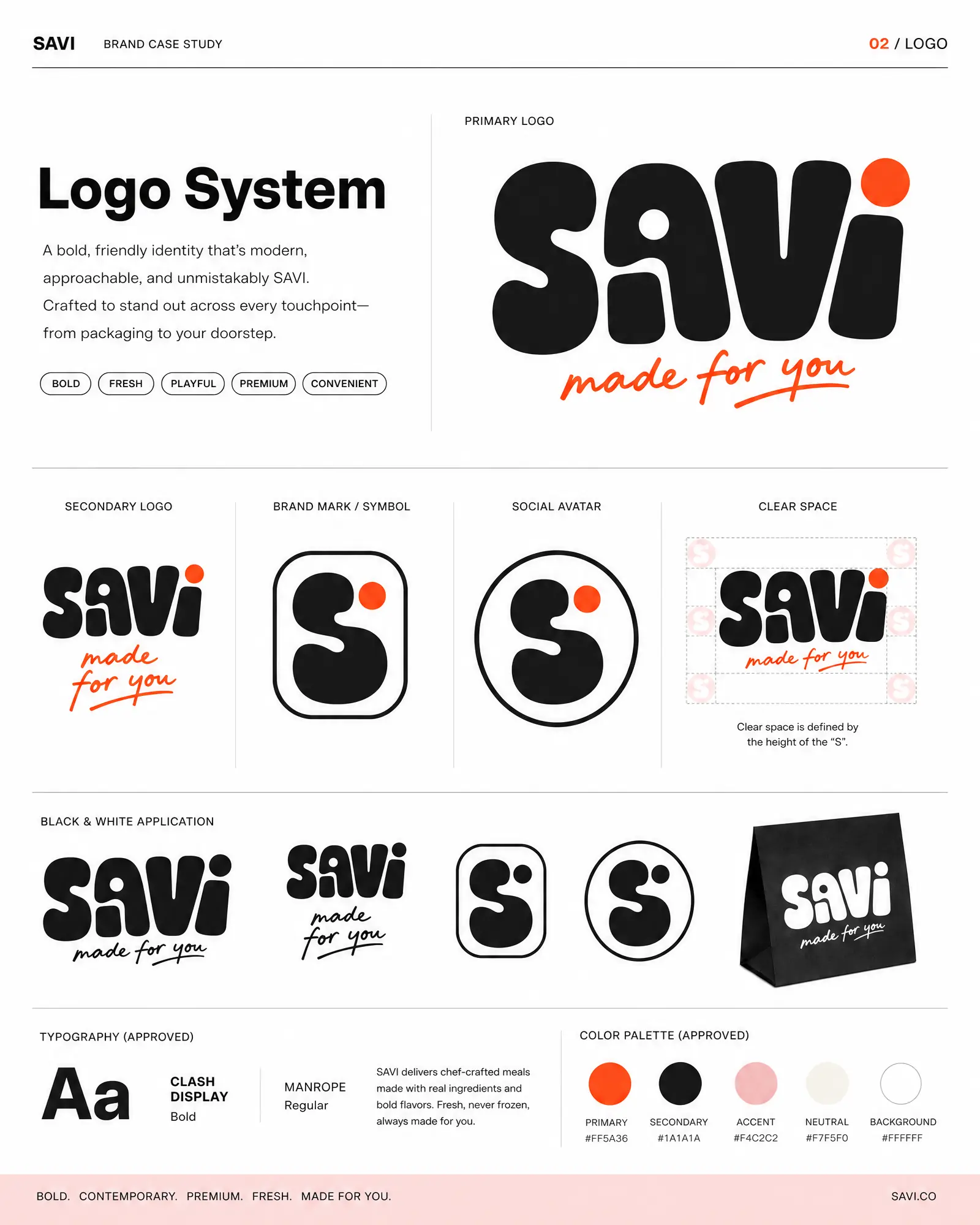
The rounded wordmark brings appetite and personality, while the compact S mark gives the brand a recognisable shorthand for packaging, avatars and small digital spaces.
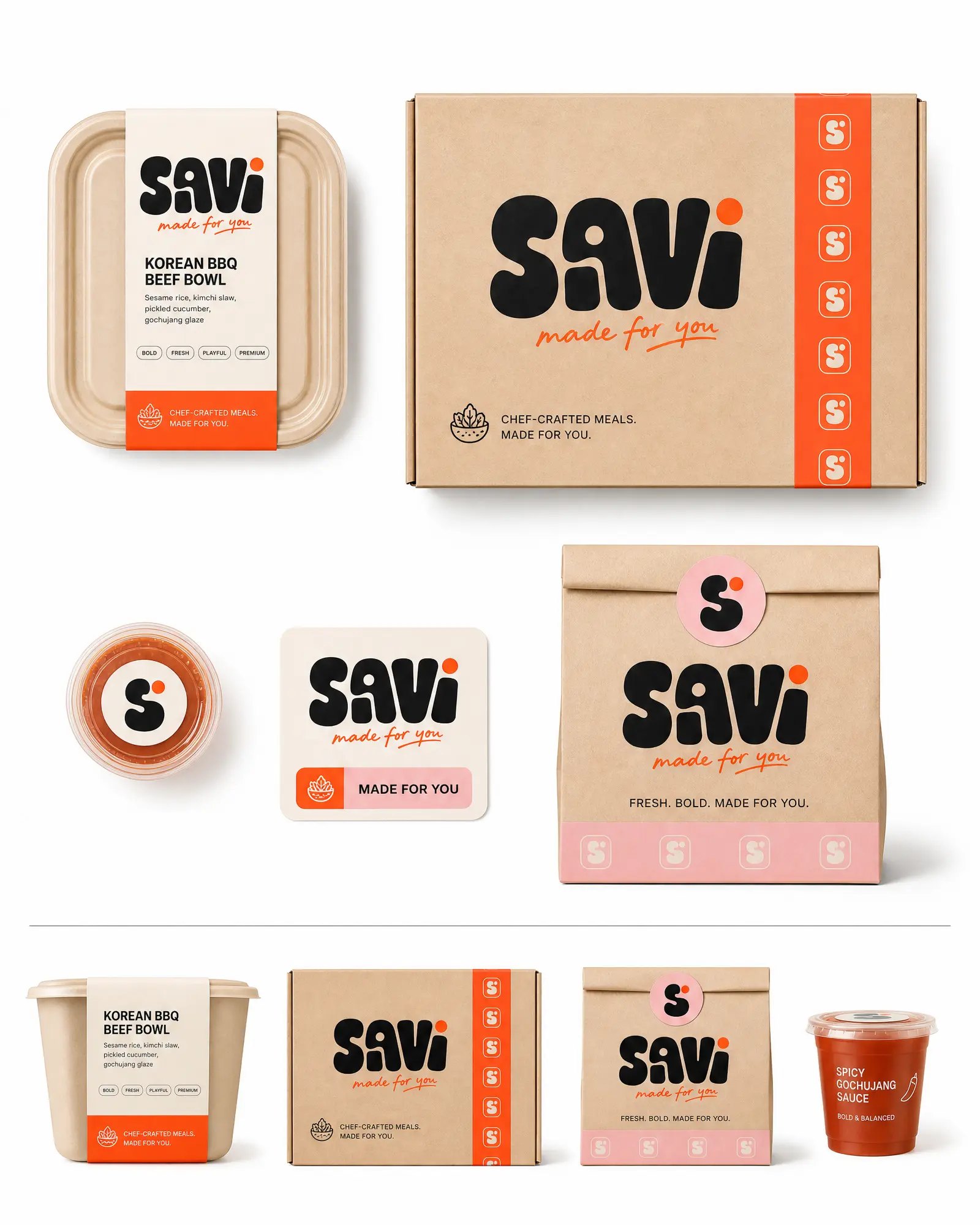
Top, front and side views show how the identity scales across different formats without losing hierarchy, appetite or shelf presence.
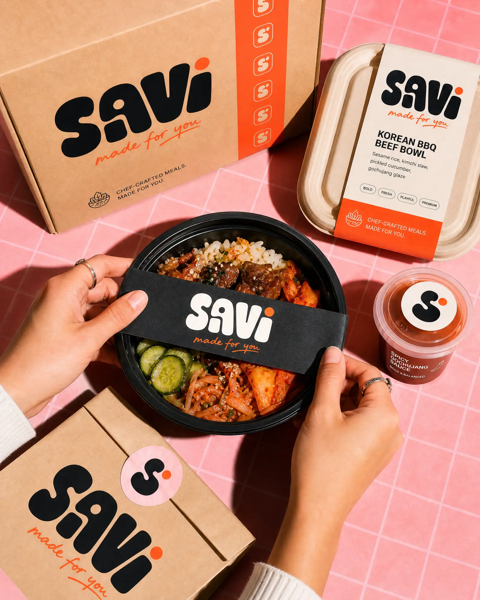
Direct flash, close crops and the pink grid create a vivid, tactile style that makes the product feel fresh, immediate and native to social feeds.
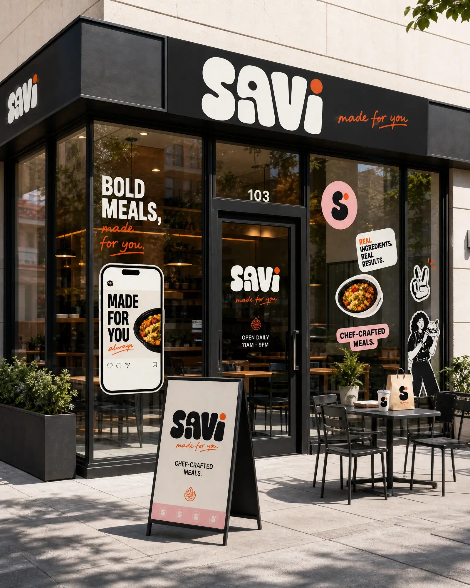
The storefront translation proves the identity can scale into a complete environment while retaining the same bold typography, stickers and social-first energy.
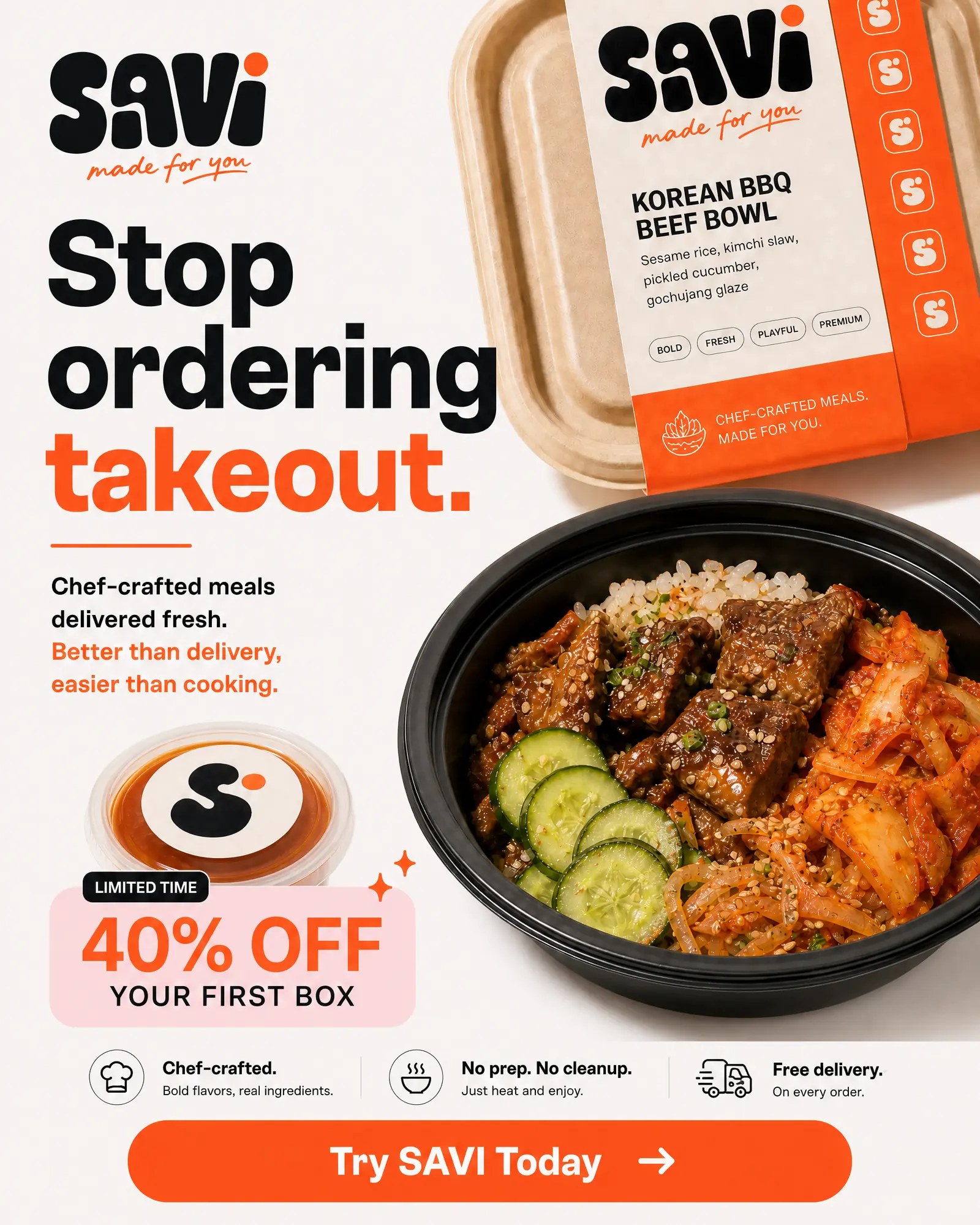
Food-led compositions create appetite, then clear value, benefits and calls to action turn the visual identity into conversion-focused creative.
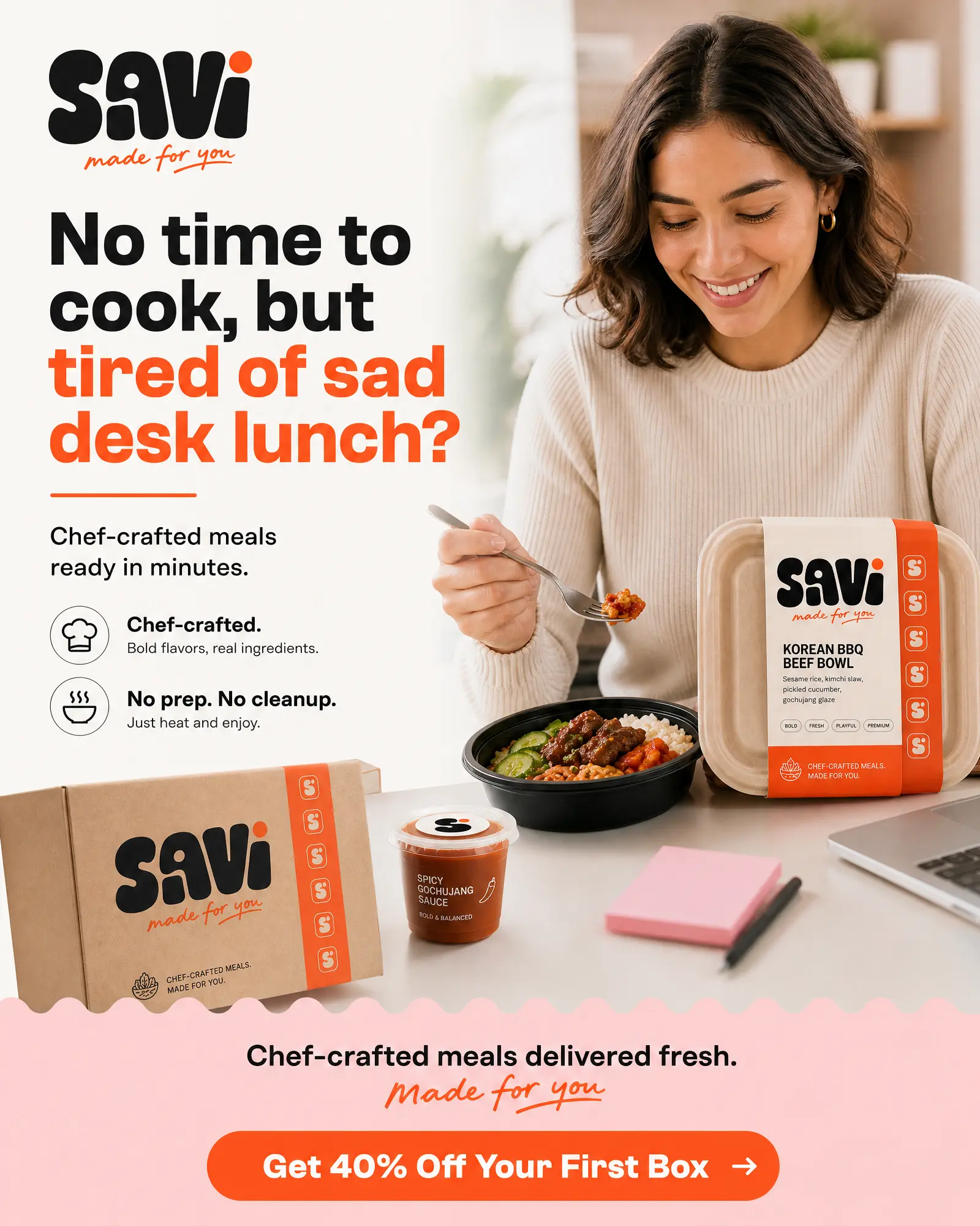
The creative opens with the recognisable pain of a disappointing desk lunch, then answers it with a clear product benefit, real food and a direct offer.
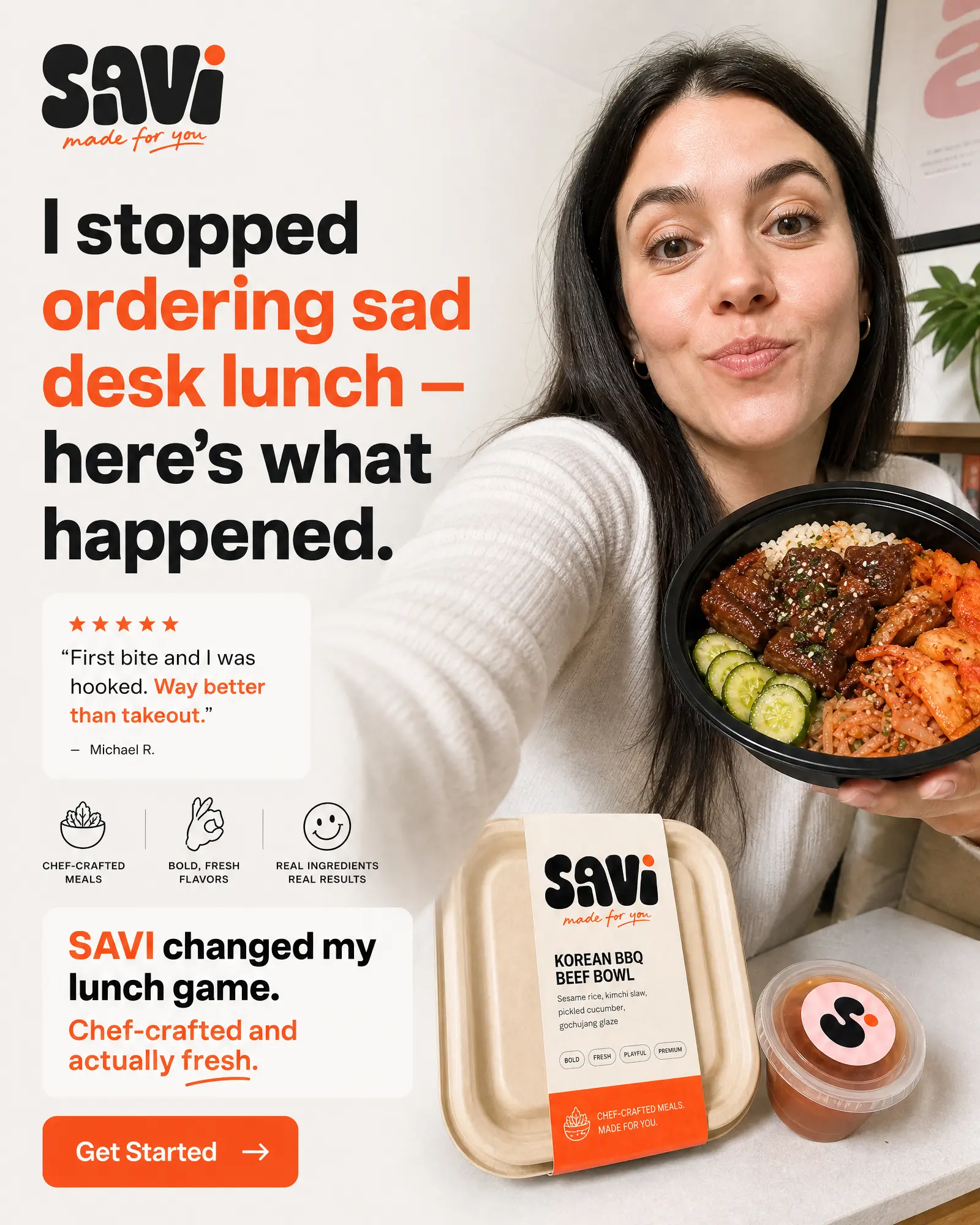
A relatable face, direct first-person hook and clear product proof bring creator-style authenticity into a layout that still feels unmistakably SAVI.
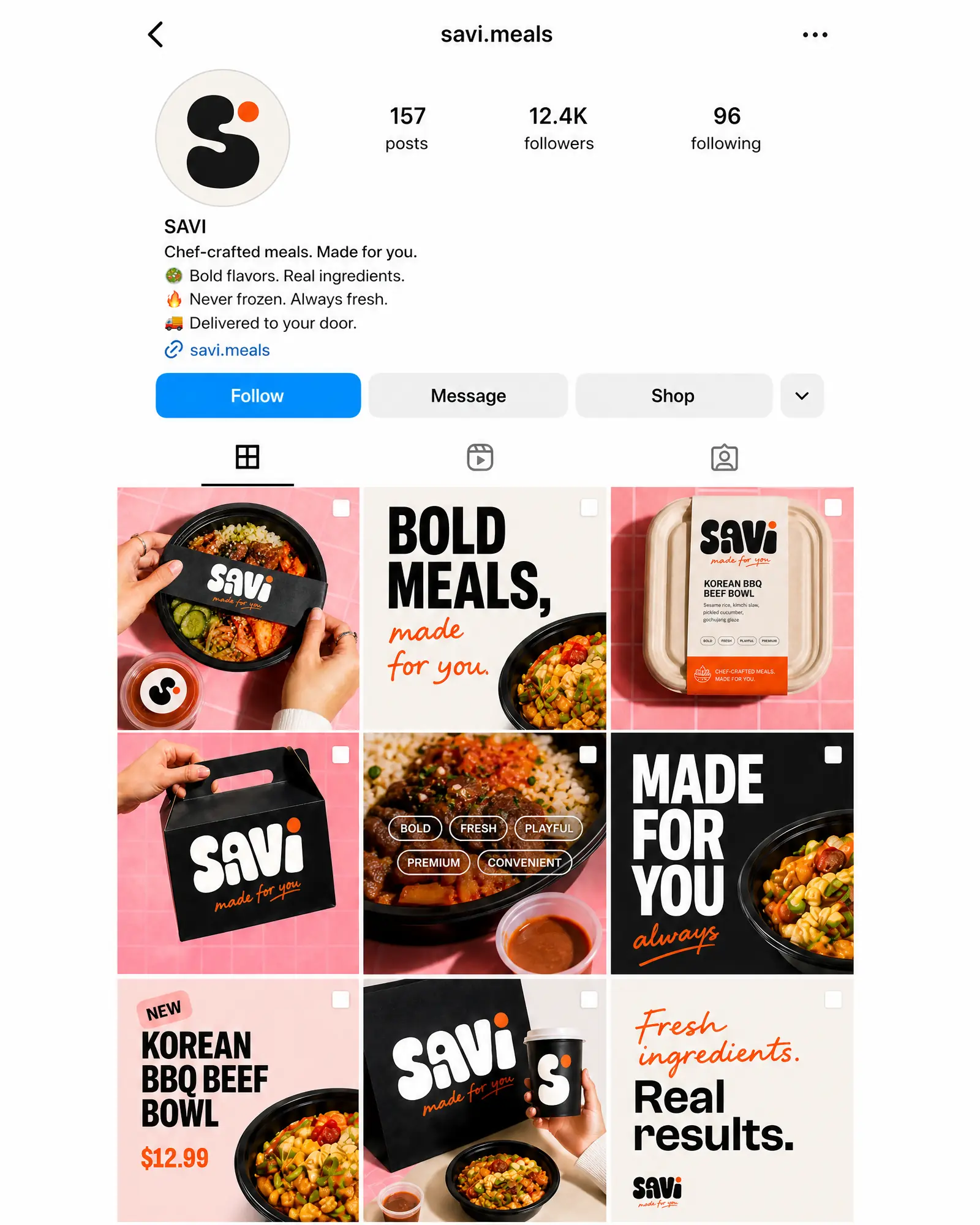
Product, typography, price, education and lifestyle posts work as one flexible system, giving SAVI enough variety for an always-on social presence.
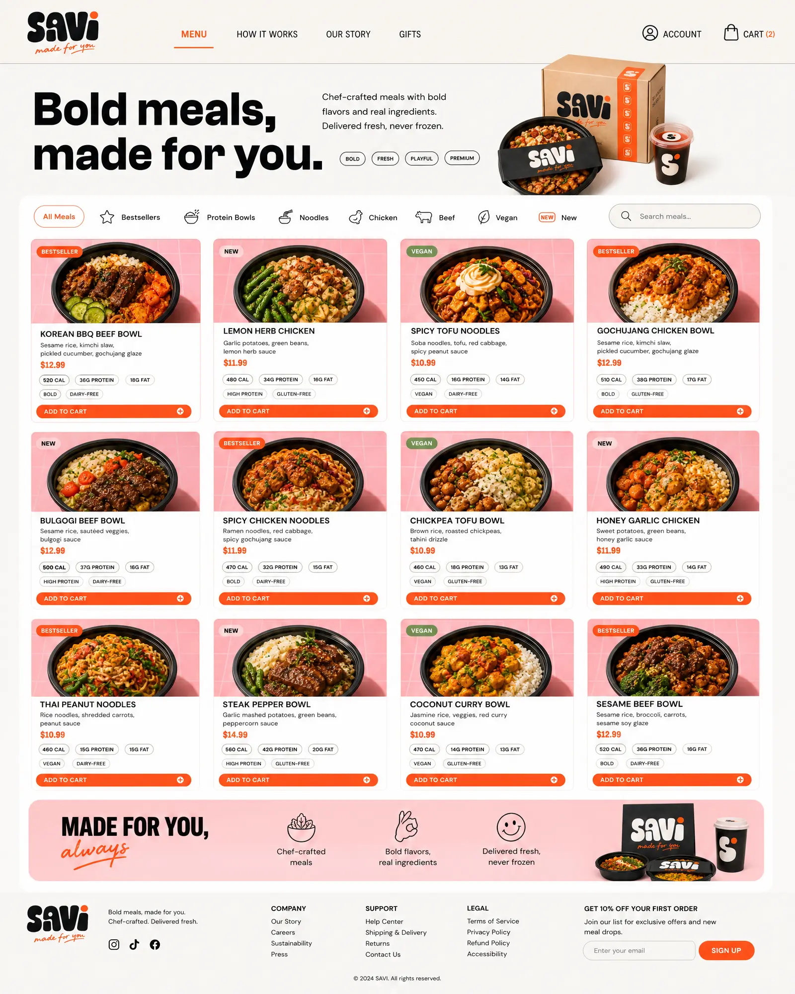
A visual menu, familiar categories and quick product comparisons make a large meal range feel simple to scan and easy to choose from.
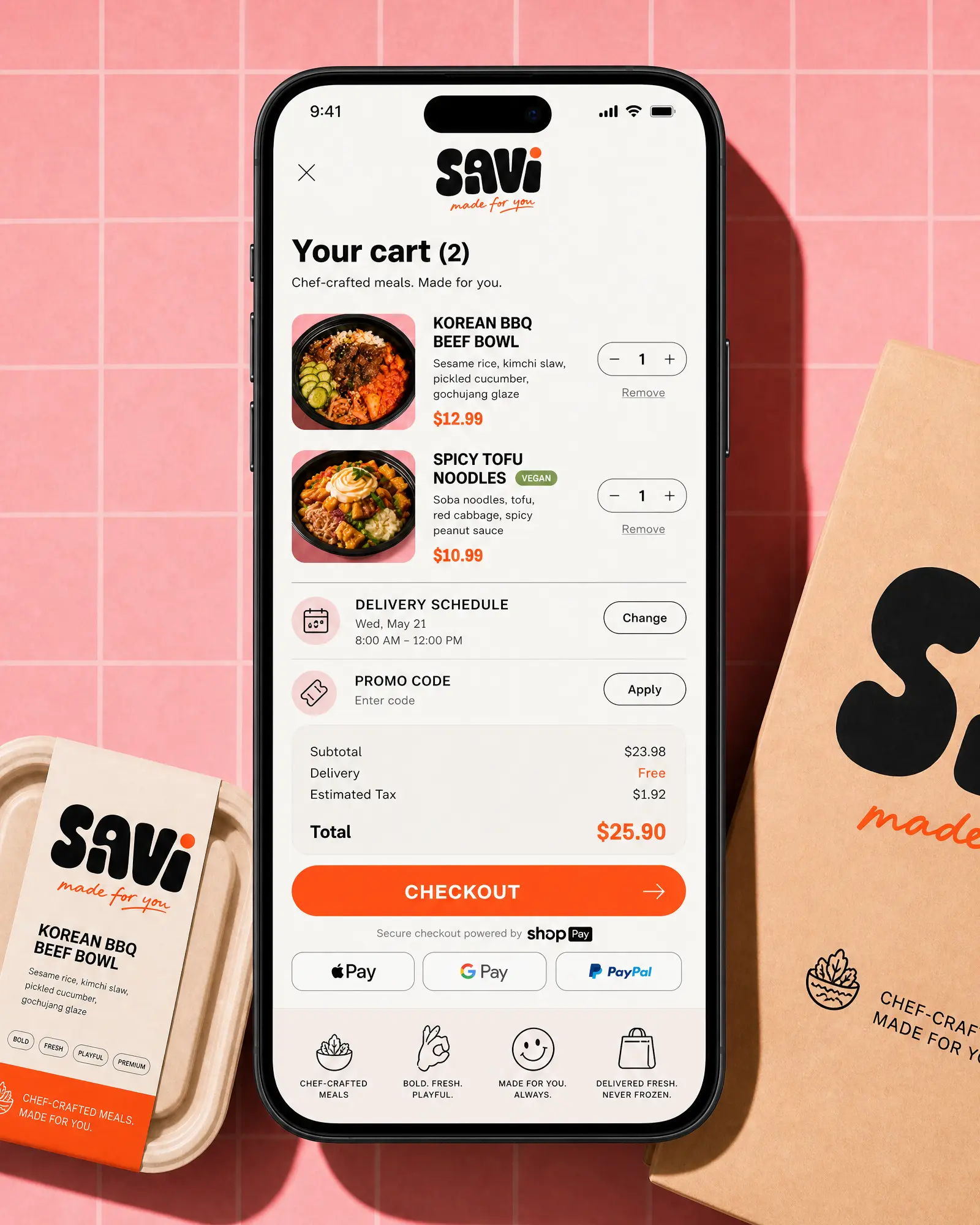
The cart keeps products, delivery timing, promo entry and express payment options visible in a single focused flow designed for small screens.
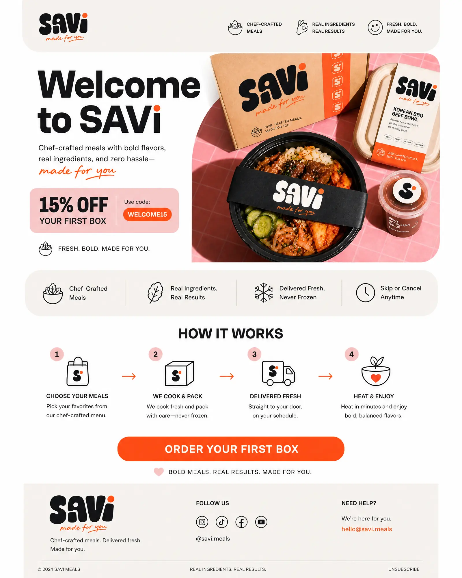
The welcome email brings the same brand hierarchy into CRM: bold benefit-led copy, simple education and a clear path to the first order.
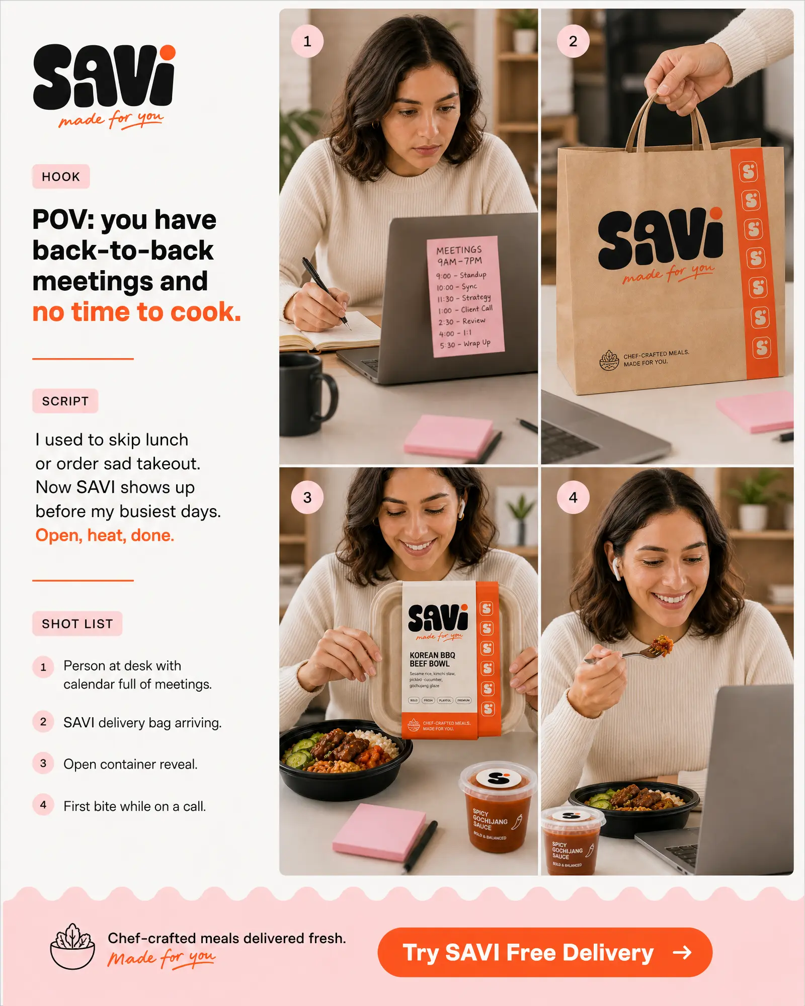
Back-to-back meetings create an immediately recognisable setup, while the delivery, reveal and first bite turn SAVI’s open-heat-done promise into a simple creator narrative.
The creative idea
ONE CLEAR IDEA
A WHOLE BRAND WORLD
The identity combines a friendly, high-impact wordmark with coral orange, soft pink, warm cream and near black. Chef-crafted food photography, direct-response messaging and a flexible graphic system connect every touchpoint—from the delivery box to social, email and UGC.