
ANGIE
ANGIE is a fashion-led eyewear brand for people who treat sunglasses as the finishing piece of a look—not just an accessory.
Brand Identity · Creative Direction · Packaging · Campaign · Performance Creative · UGC
The category is crowded with similar product imagery and trend-led claims. ANGIE needed a distinctive visual world that could feel premium, expressive and instantly recognisable across packaging, campaign and performance channels.
Brand story
Made to complete the look
ANGIE was built around a simple insight: one frame can change the entire energy of an outfit. The brand treats eyewear as a styling decision with confidence, personality and impact.
The system combines fashion-editorial restraint with bold DTC communication, giving the brand enough polish for campaign imagery and enough energy for performance ads, creator content and product launches.
One frame. Whole new look.Designed to elevate. Made to be remembered.
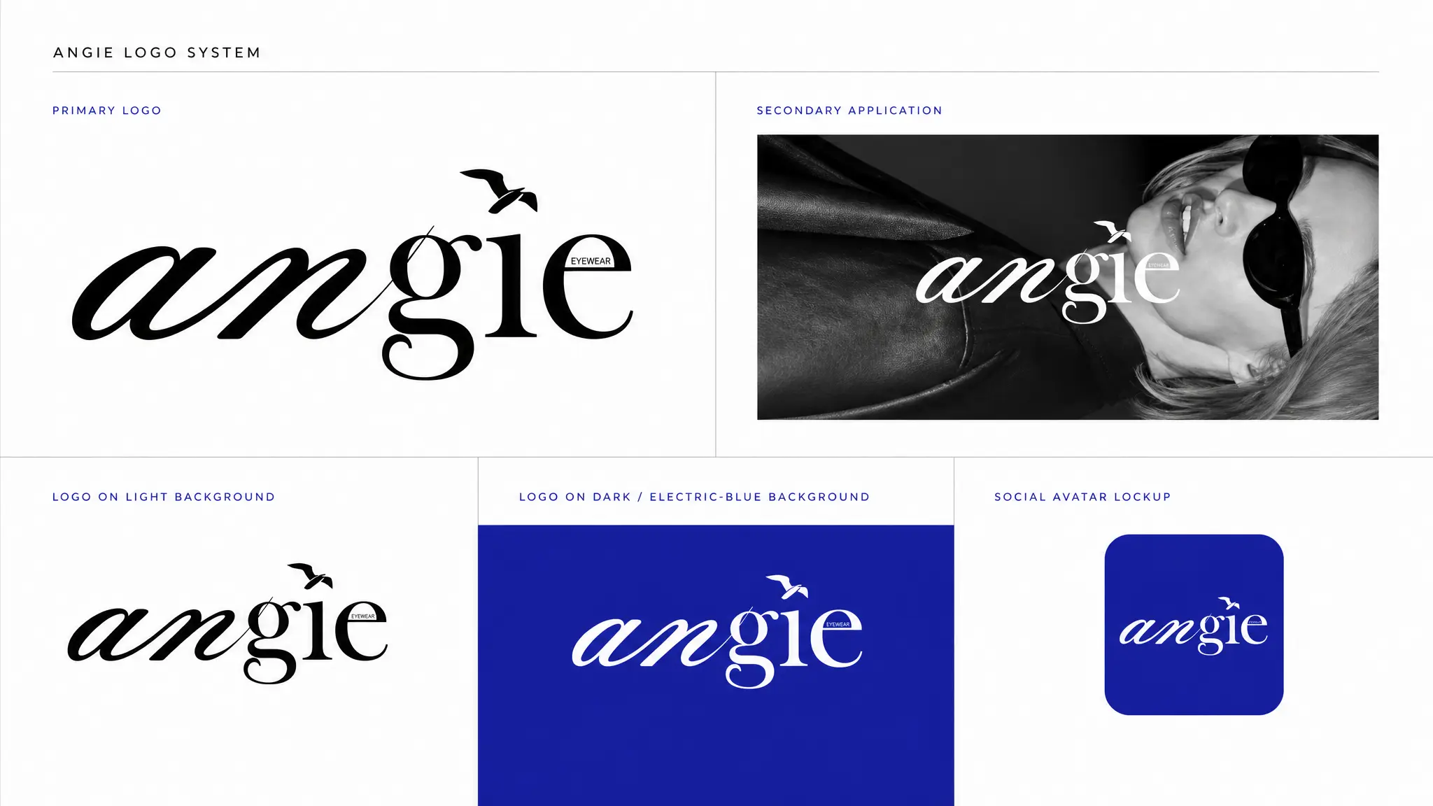
The custom wordmark combines expressive curves, sharp contrast and a bird detail to make ANGIE instantly recognisable across fashion and digital touchpoints.
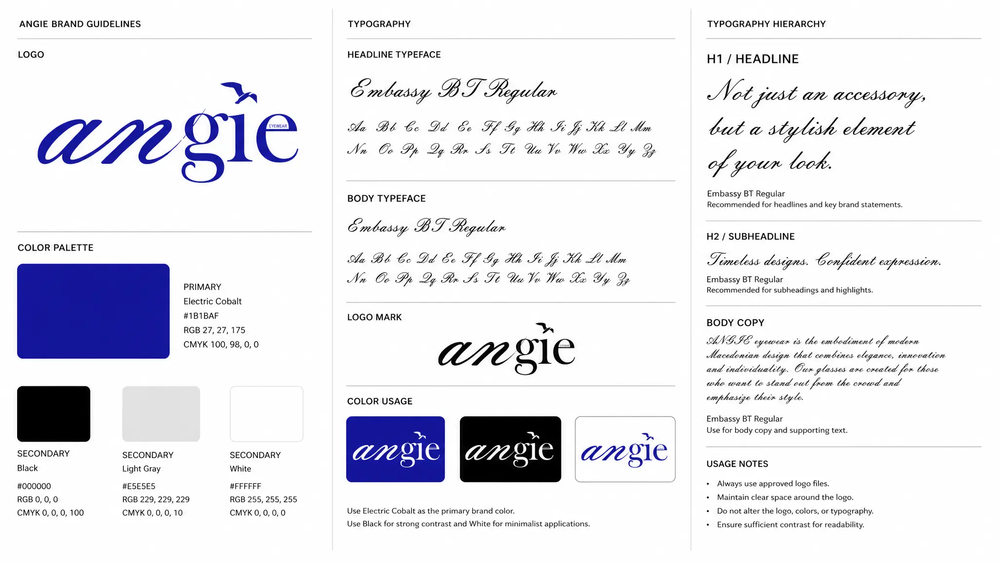
A restrained black-and-white base gives the cobalt room to lead, while the serif and script contrast creates a fashion-forward hierarchy with personality.
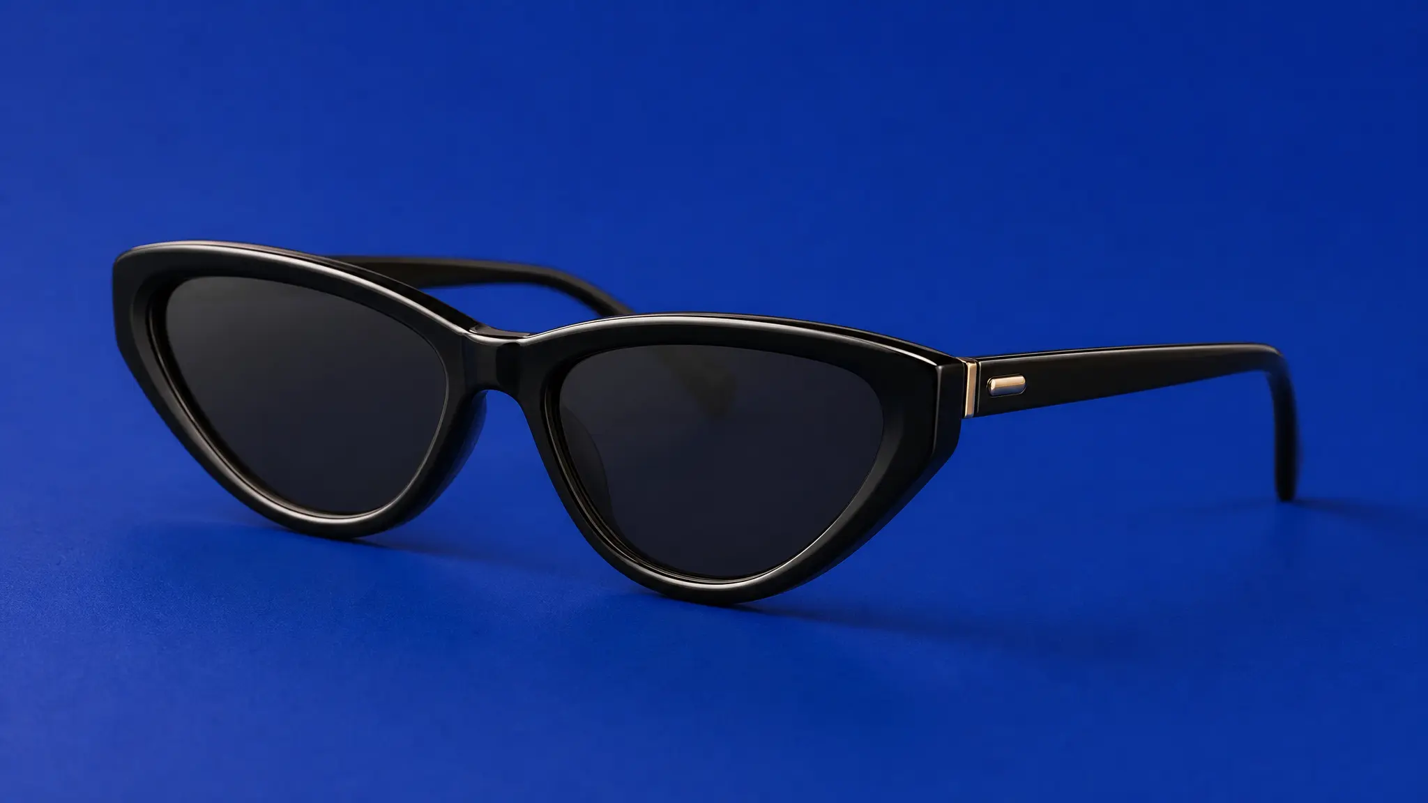
Clean, high-contrast product photography isolates the silhouette and material detail so the product remains premium and immediately shoppable.
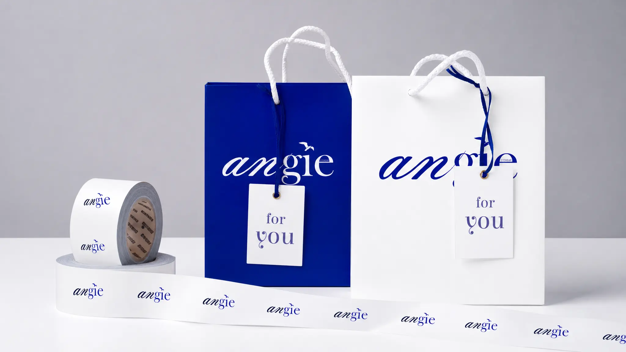
Cobalt and white packaging extends the identity beyond the frame, creating a recognisable delivery and retail experience from first glance.
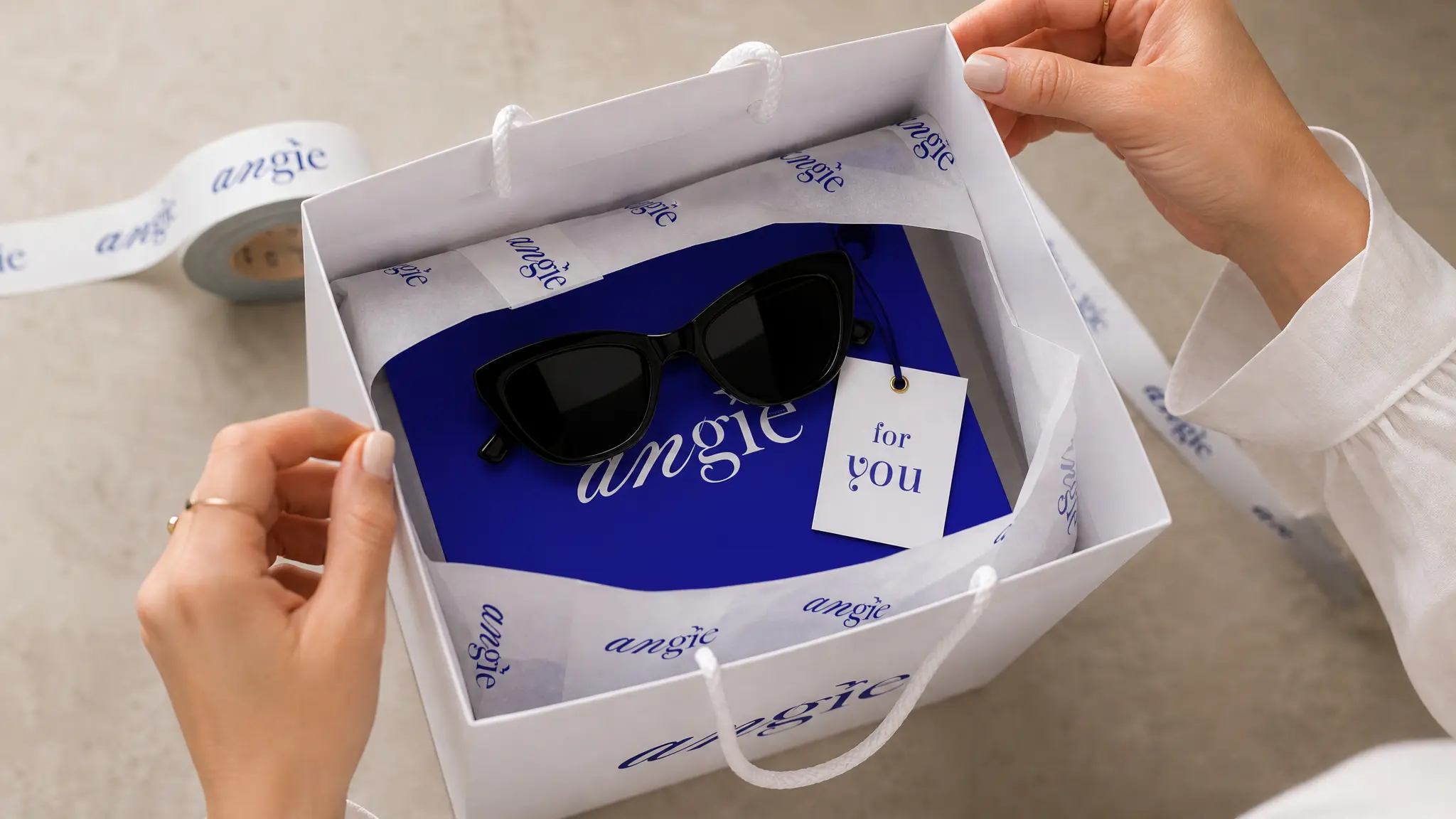
Layered tissue, colour contrast and small branded details turn the product reveal into a tactile, social-ready moment.
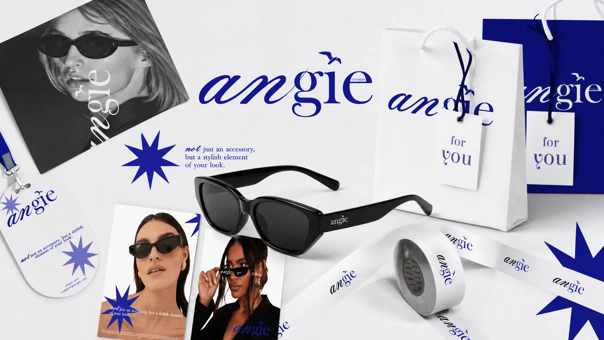
Packaging, printed matter, campaign imagery and product assets work as one coherent toolkit built for both premium storytelling and daily content.
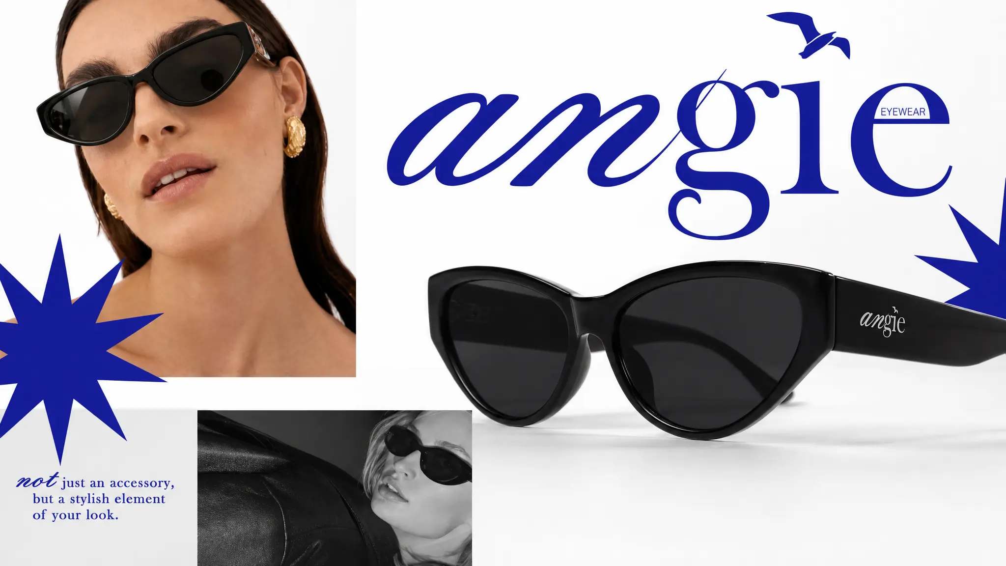
Oversized typography and close product detail create visual drama without losing the frame’s shape, finish or brand signature.
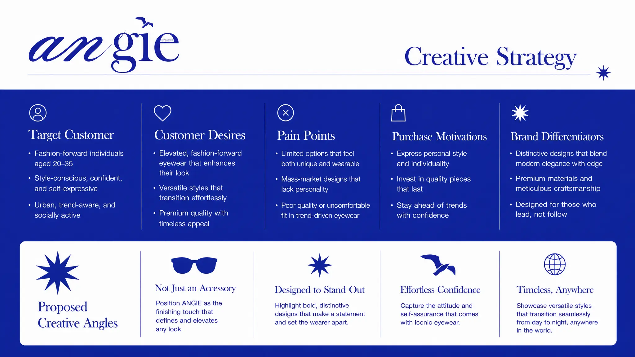
Audience desires, pain points and purchase motivations translate the brand idea into four usable creative angles—giving every campaign a strategic reason to exist.
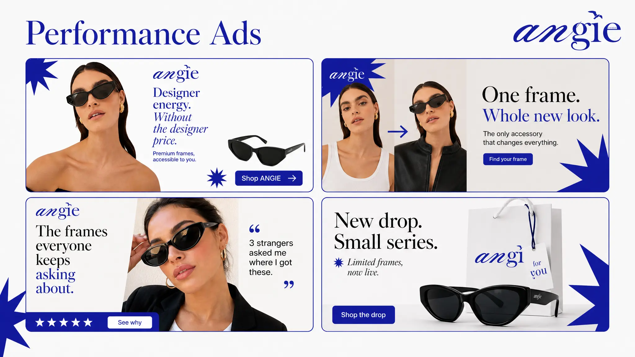
Product, transformation, social proof and scarcity become distinct ad routes while the cobalt, editorial typography and sharp framing keep every execution recognisably ANGIE.
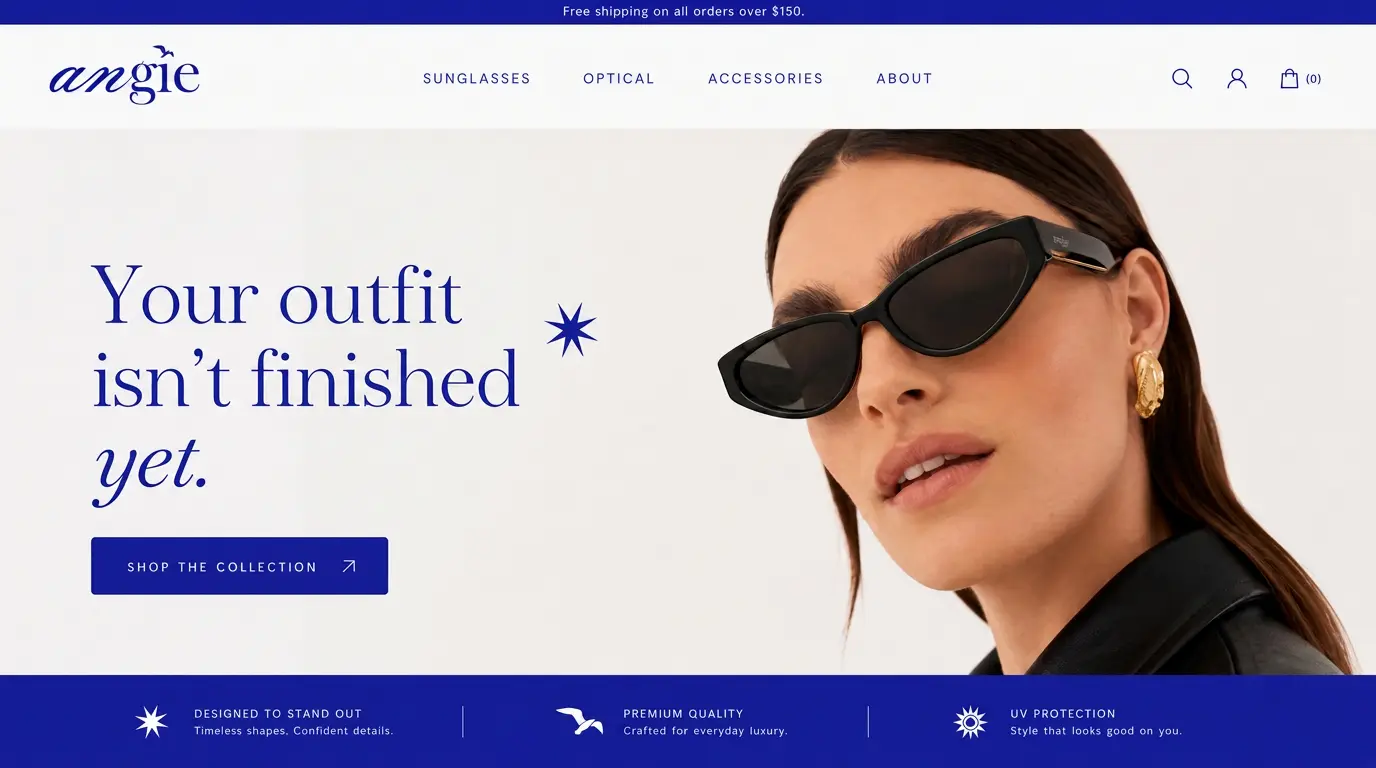
The homepage leads with the styling transformation, keeps the product visible and uses a direct collection CTA—balancing editorial presence with a clear path to shop.
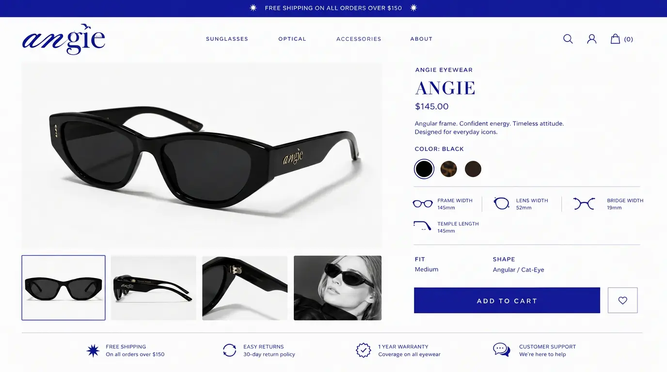
Large product imagery, measurements, colour options and reassurance cues remove uncertainty while protecting the premium simplicity of the brand.
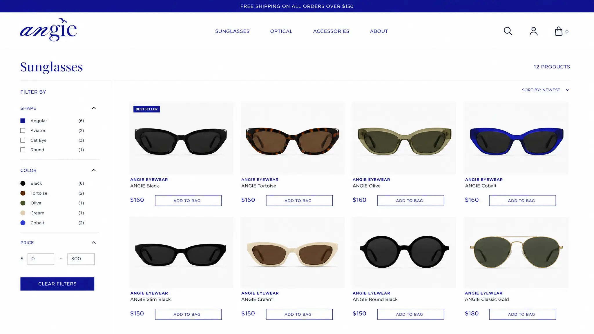
Filters, consistent product framing and visible prices turn the collection into a calm, comparison-friendly shopping experience.
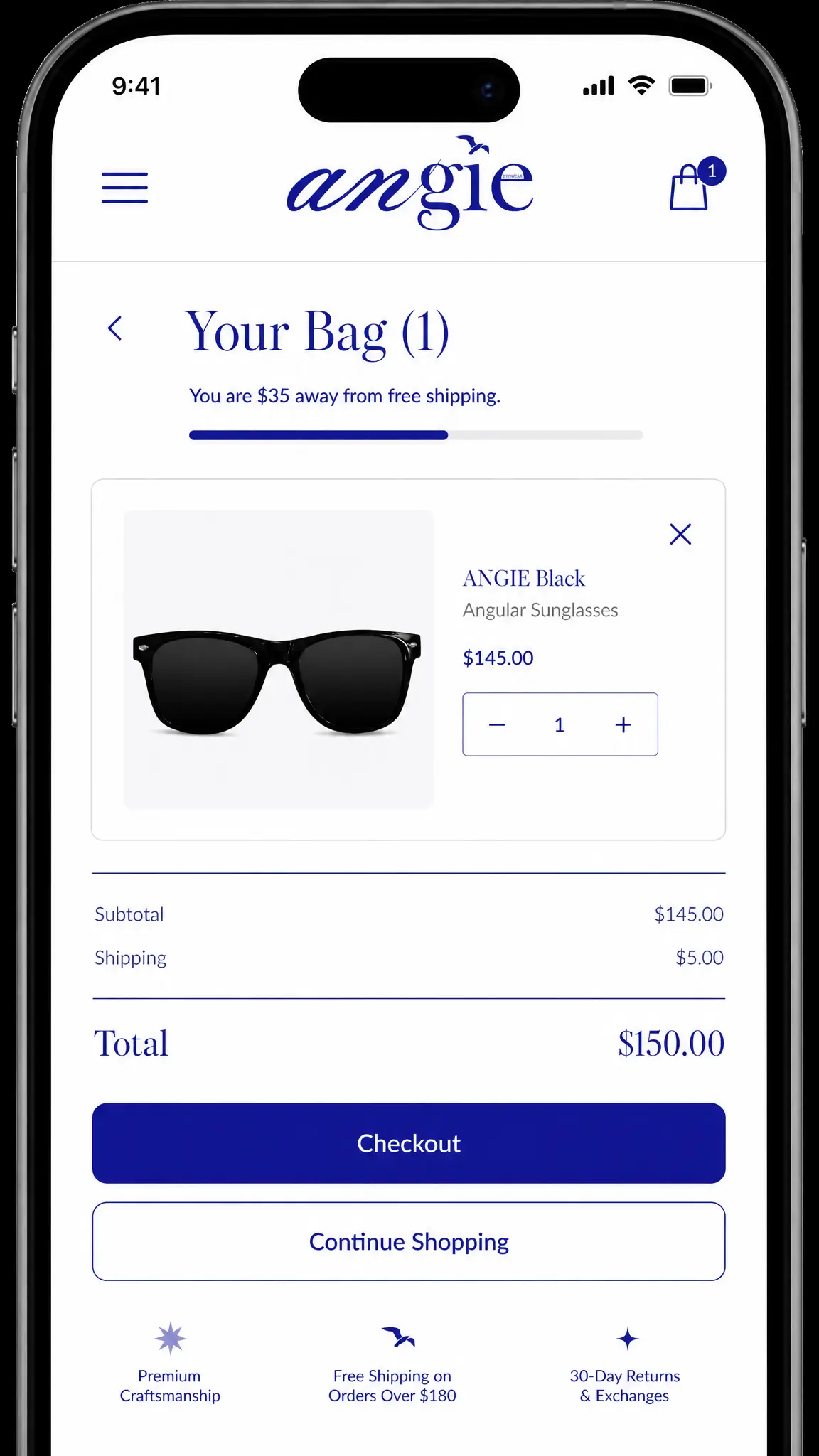
The cart keeps product, quantity, delivery value and checkout action in a single readable flow, proving the system works beyond campaign imagery.
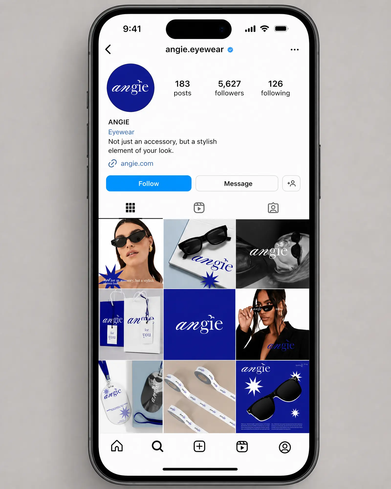
Portraits, product, packaging and graphic moments alternate with a consistent cobalt rhythm, creating variety without losing brand recall.
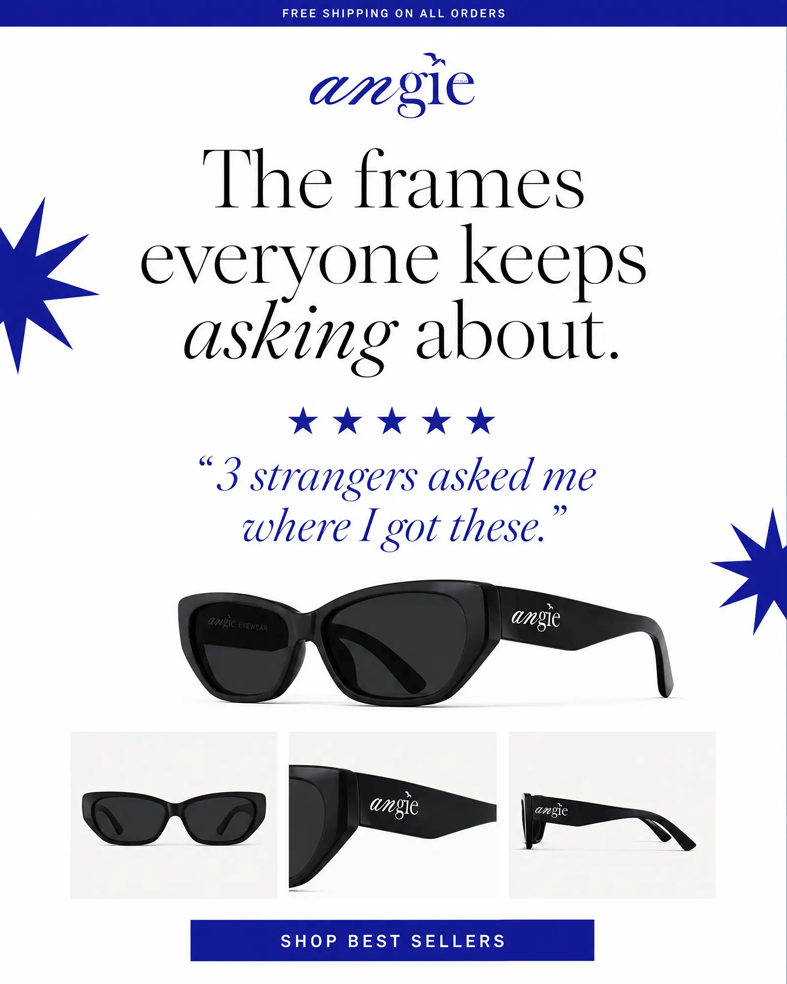
A single customer quote, clear product angles and a direct CTA turn the campaign promise into an email that builds trust and drives product discovery.
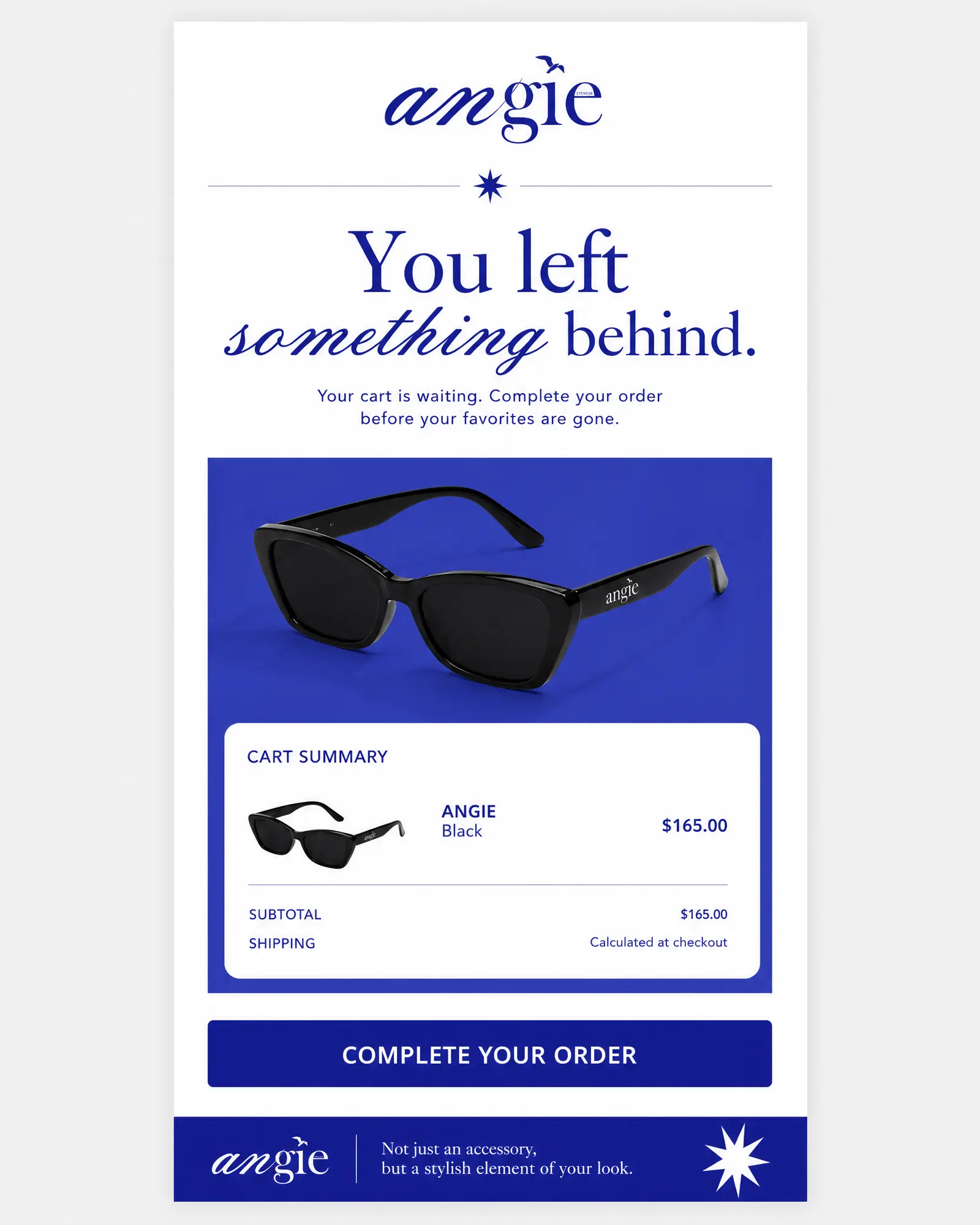
The abandoned-cart flow prioritises the product, cart clarity and one decisive action while remaining fully inside ANGIE’s visual world.
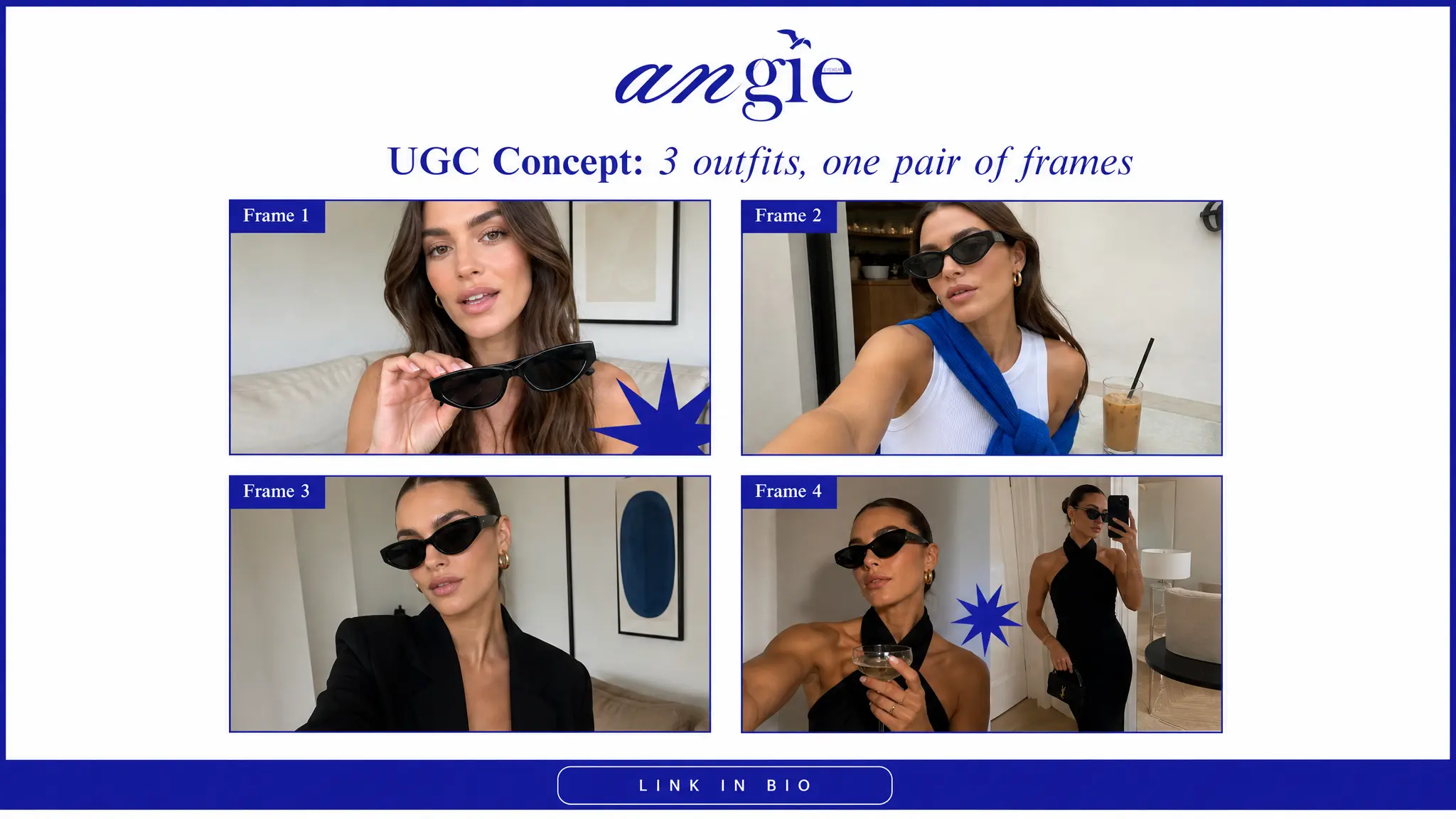
The concept demonstrates versatility through a simple creator narrative: the same sunglasses move from casual to tailored to evening without losing personality.
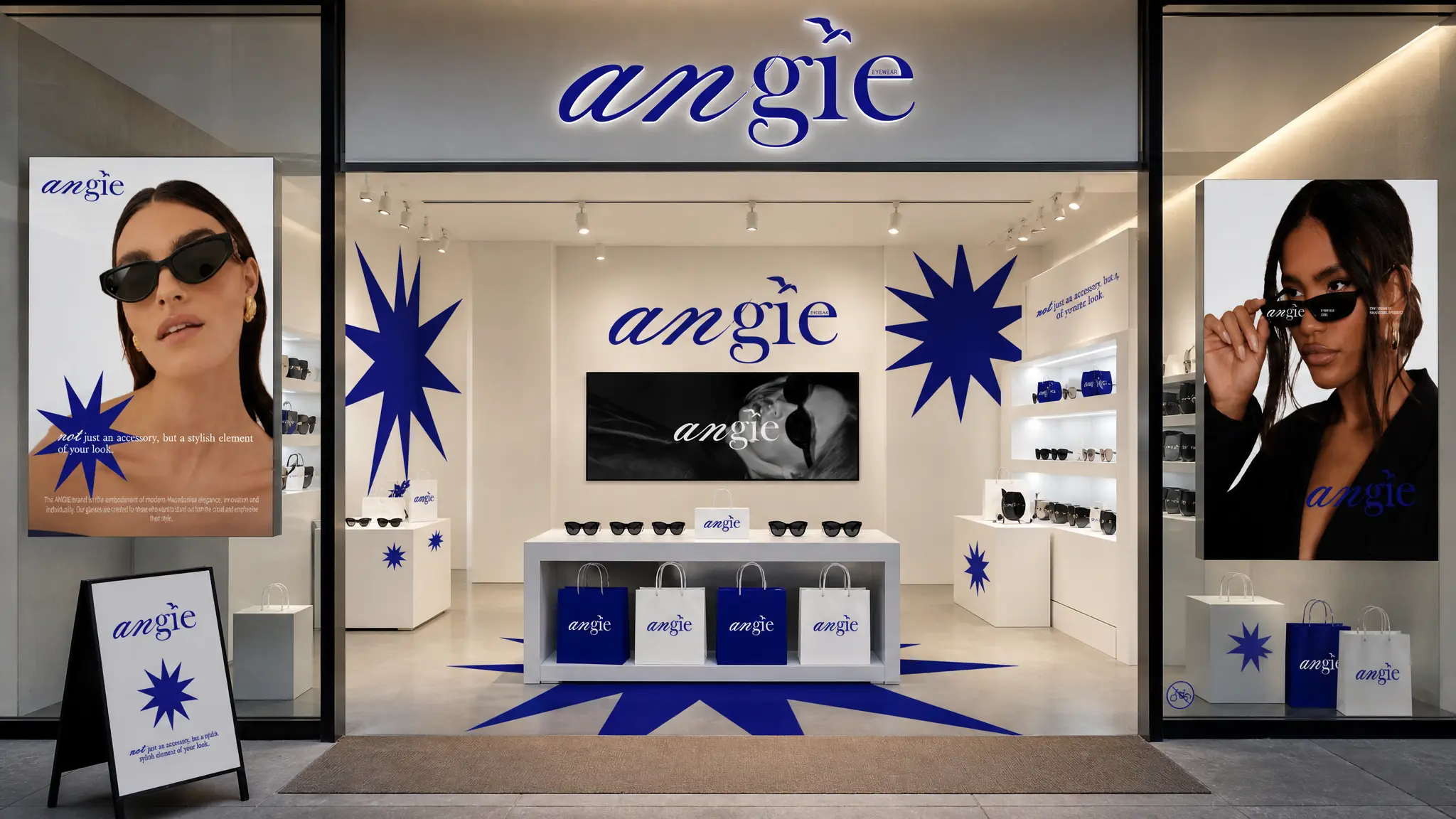
Cobalt starbursts, large-scale wordmarks and monochrome display fixtures translate ANGIE into a memorable pop-up without adding unnecessary visual noise.
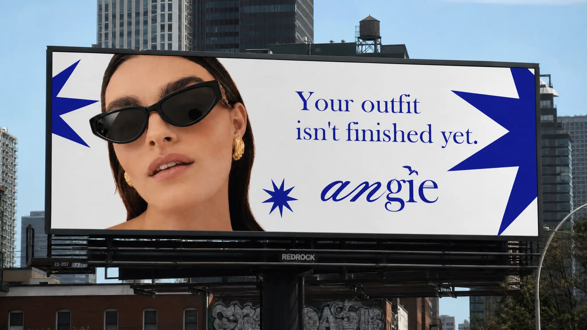
One close crop and one direct line make the campaign readable at distance, proving the visual identity can scale from a phone screen to a city billboard.
The creative idea
ONE CLEAR IDEA
A WHOLE BRAND WORLD
Electric cobalt, sharp starbursts, editorial typography and high-contrast fashion photography create a flexible identity that moves easily from premium brand moments to fast, social-first creative.