LUMIERE
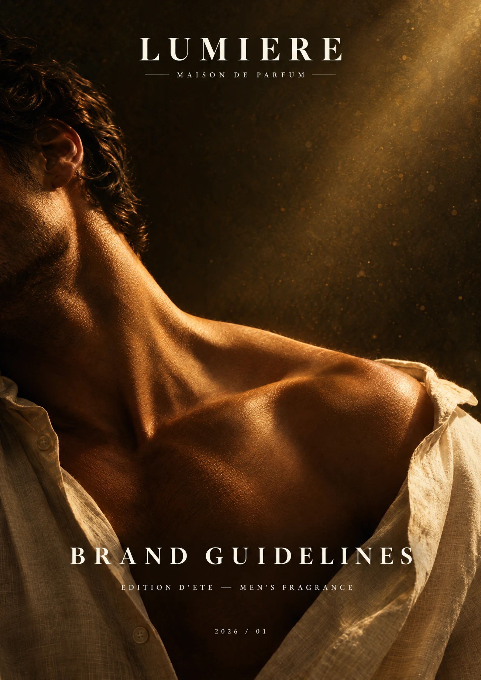
LUMIERE is a limited-edition fragrance identity shaped around warmth, memory and the last light of a summer day.
Brand Identity · Art Direction · Typography · Color System
The visual world needed to feel sensual and refined while giving the fragrance a clear signature across logo, typography, color and campaign imagery.
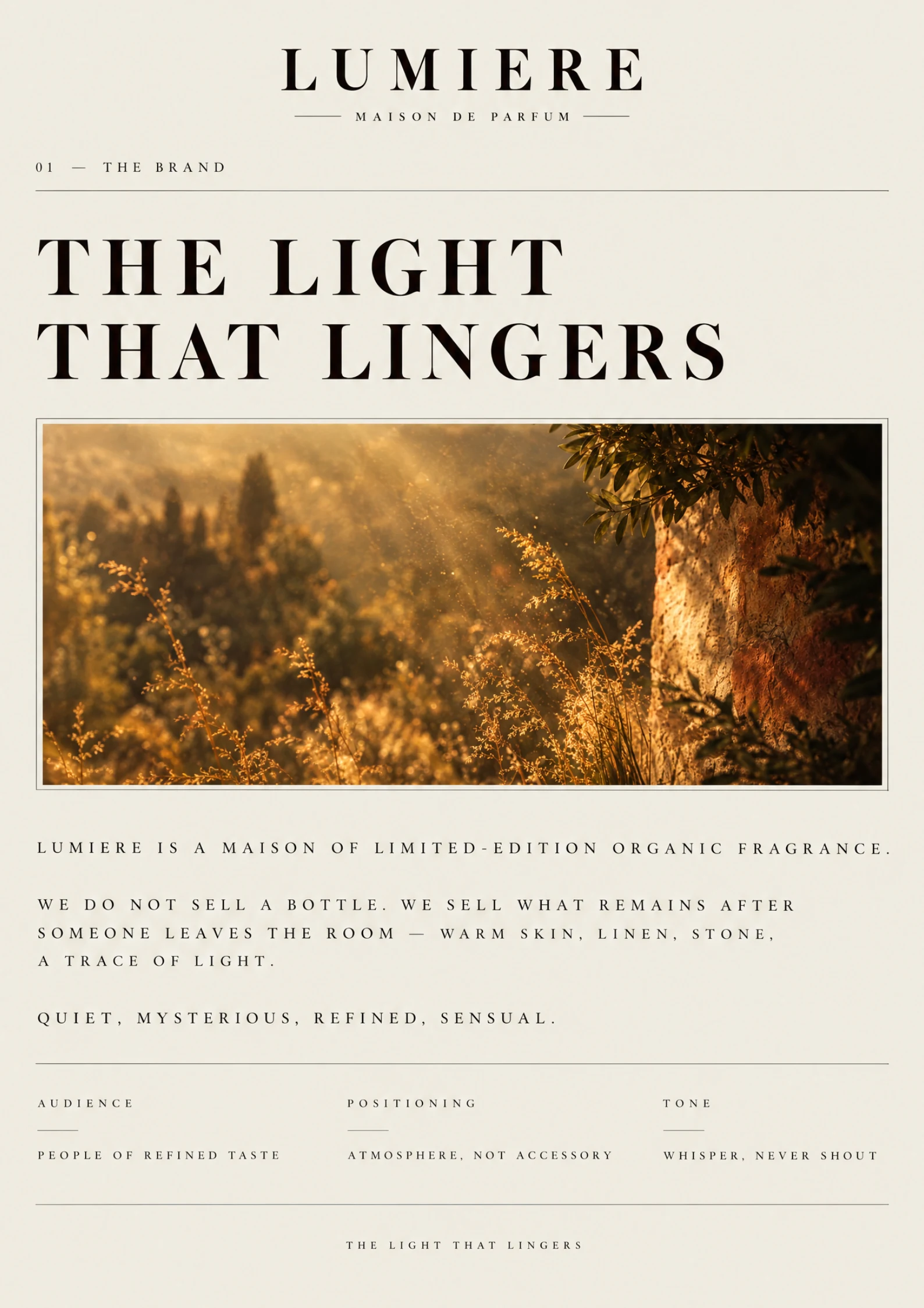
Warm landscape photography and quiet, spacious typography introduce a fragrance world built around memory and light.
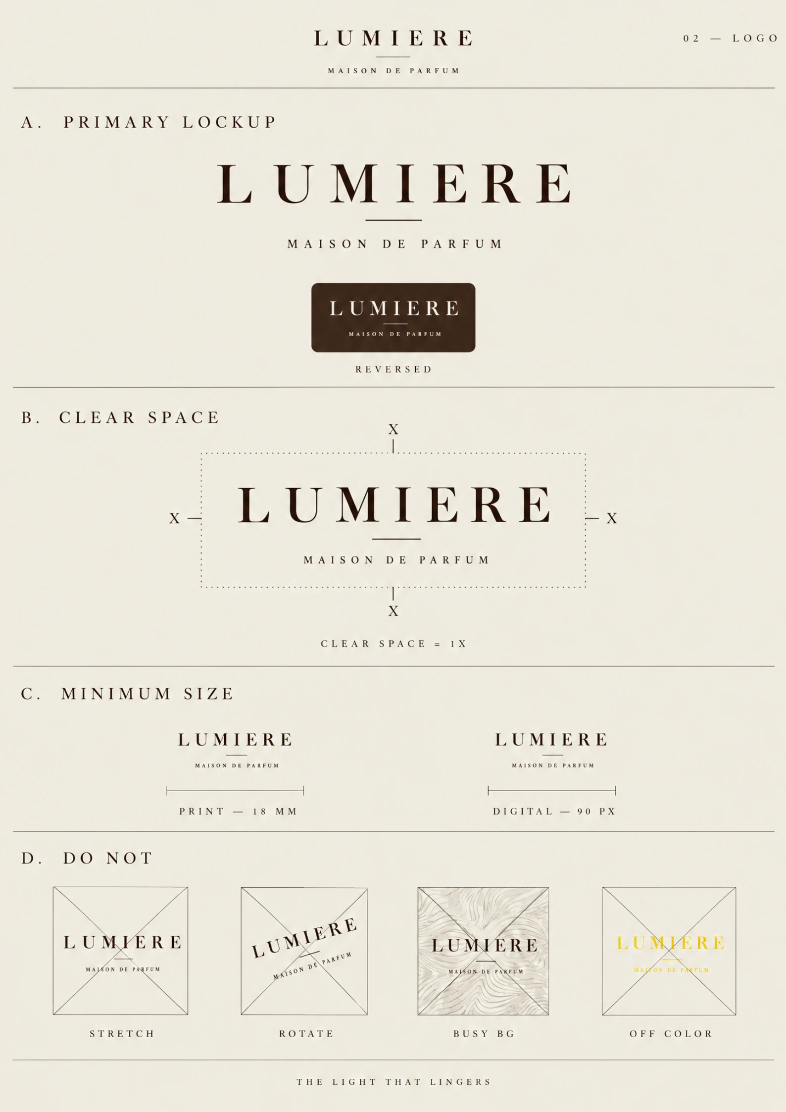
The primary lockup, reversed mark, clear-space rules and minimum sizes make the wordmark usable across print and digital.
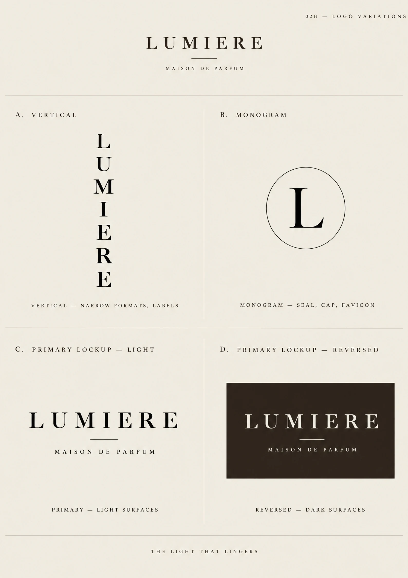
Vertical, monogram and light or dark lockups extend the mark into narrow formats and campaign applications.
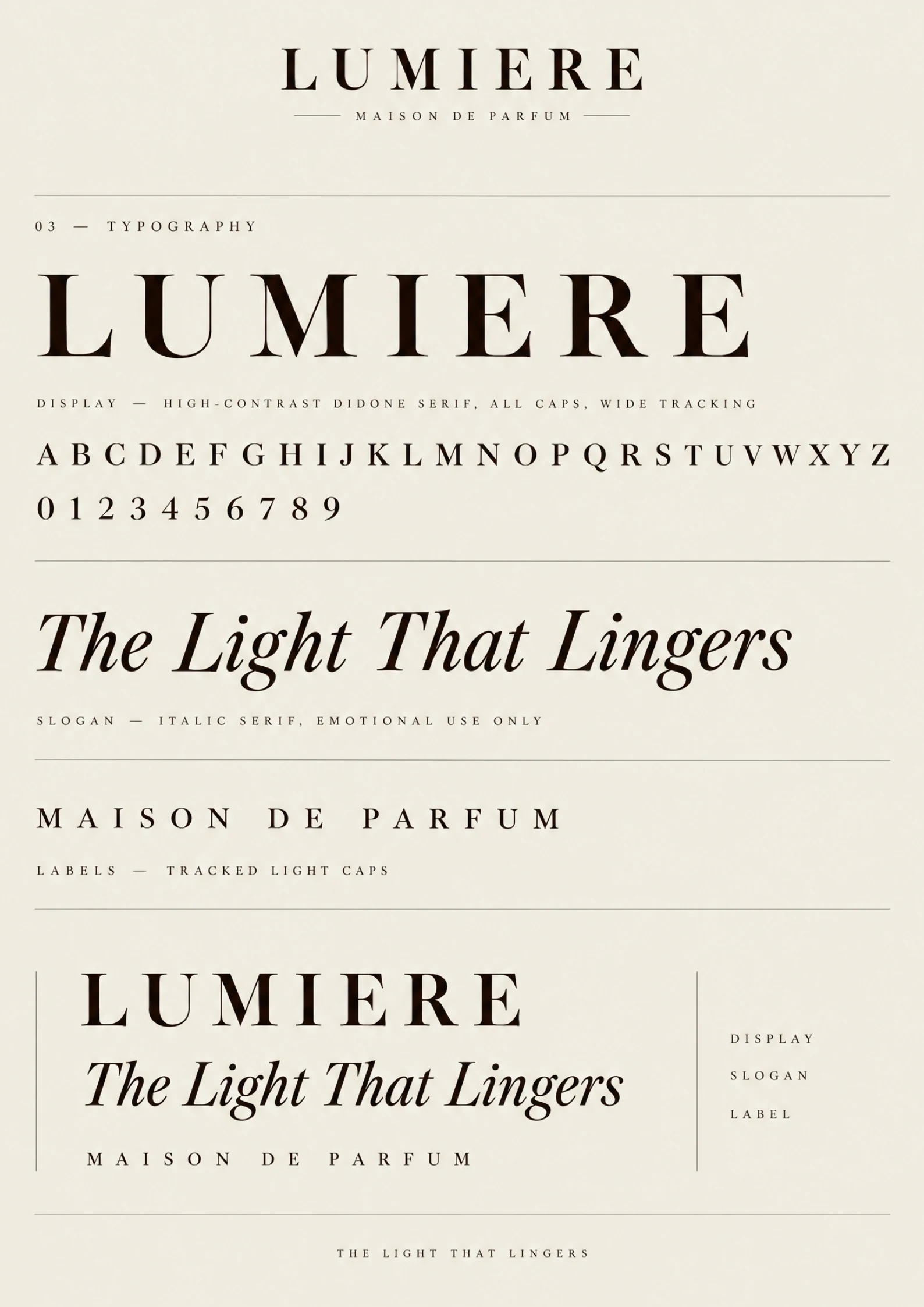
A high-contrast display serif, italic slogan and tracked capitals create a distinctive hierarchy for the maison.
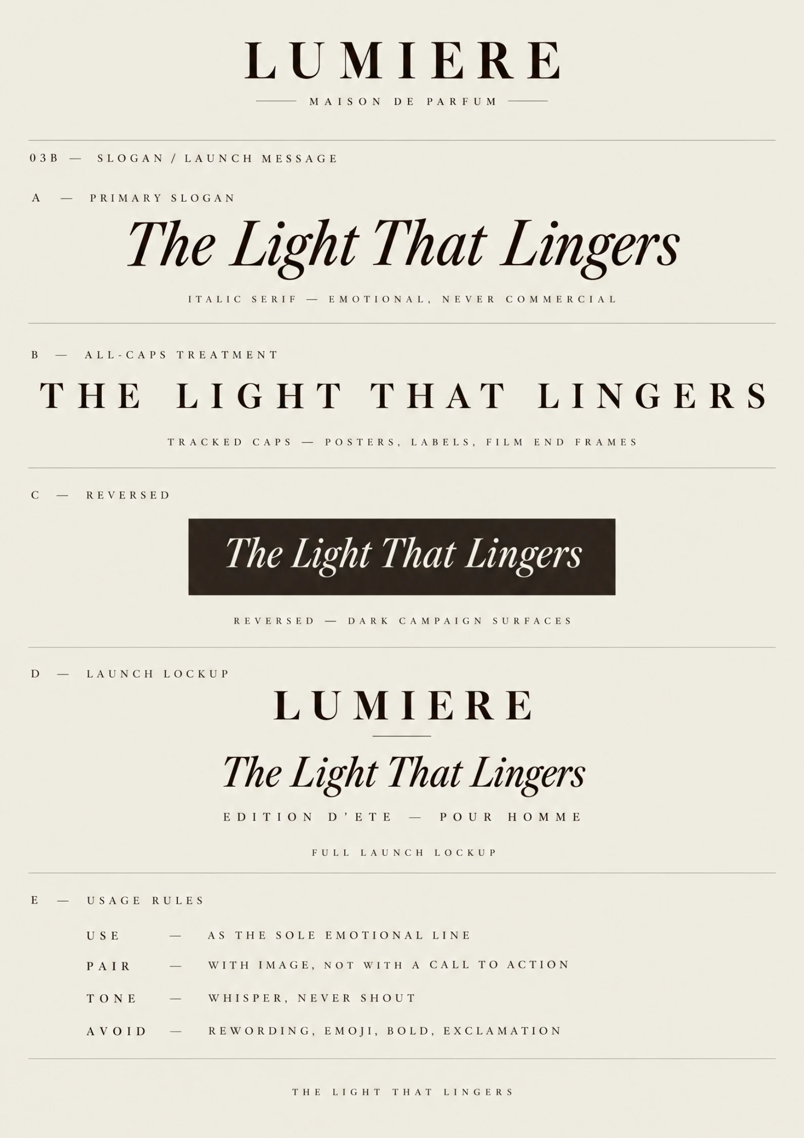
The Light That Lingers moves between expressive italics, capitals and reversed campaign treatments.
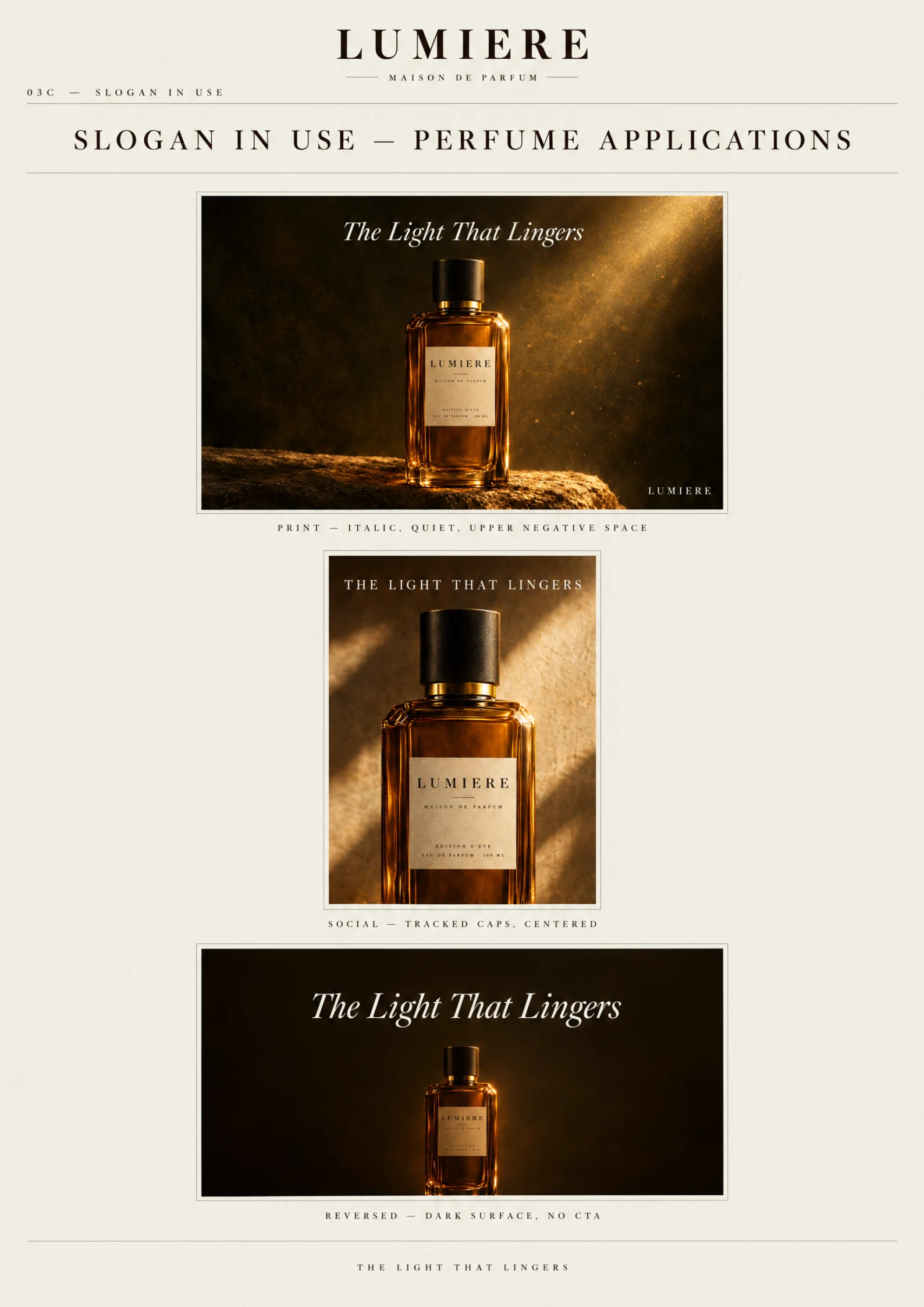
Product imagery pairs the bottle with amber highlights and dark surroundings across several campaign layouts.
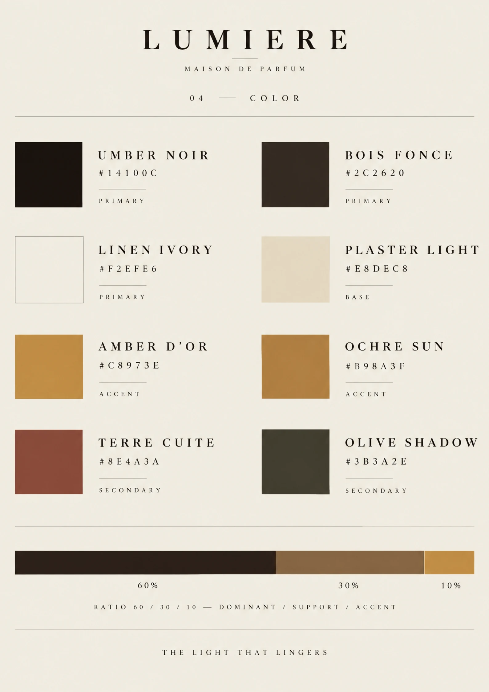
The palette moves from deep shadow and linen light to warm gold, ochre and earthy supporting tones.
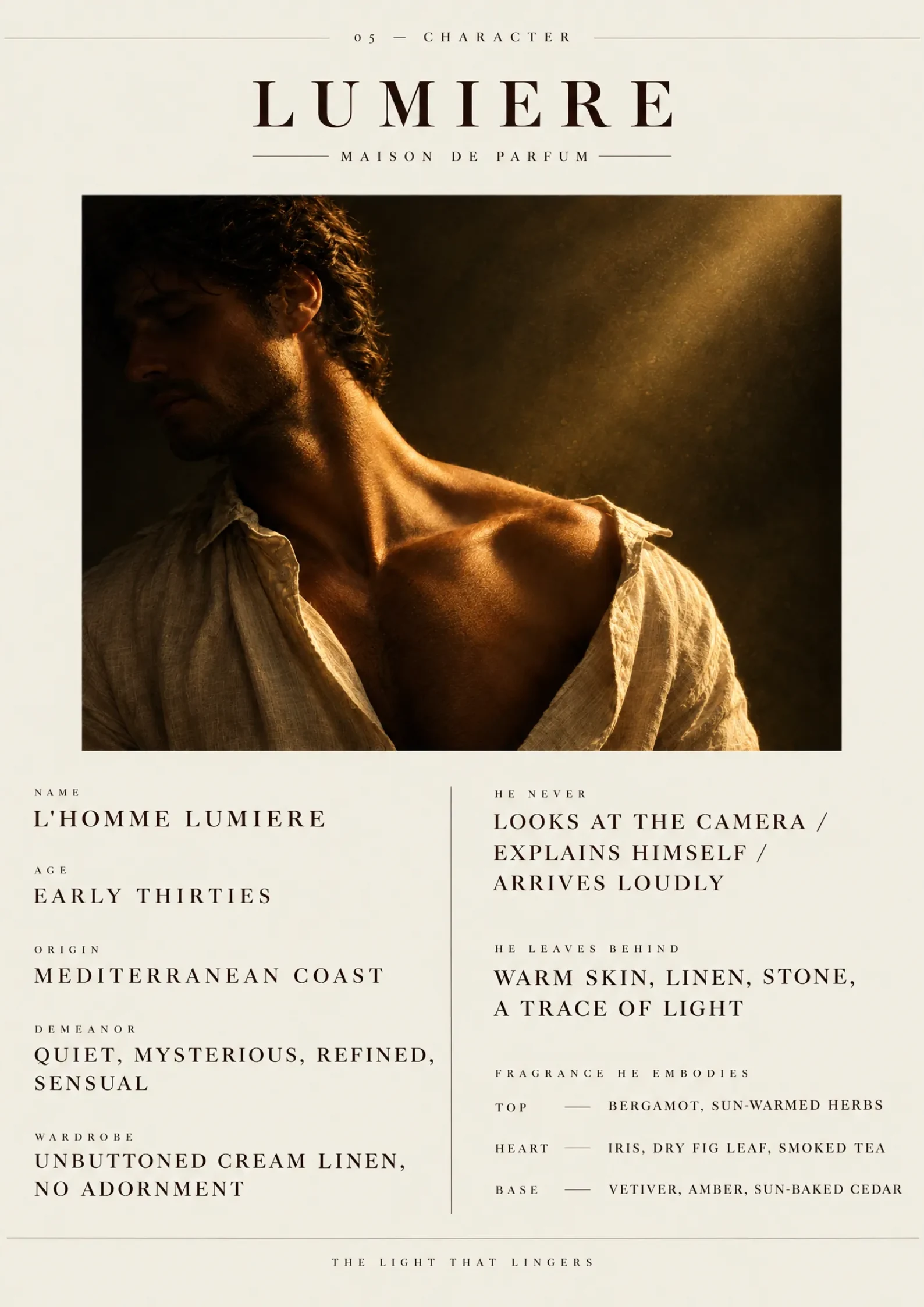
The casting and styling board connects the fragrance's understated mood to a warm, intimate portrait.
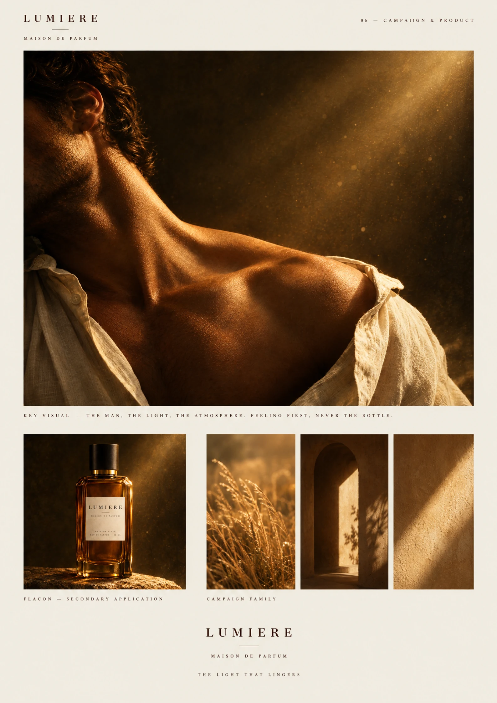
Portrait, bottle, landscape and architectural studies share the same controlled, late-day light.
The creative idea
ONE CLEAR IDEA
A WHOLE BRAND WORLD
A high-contrast serif wordmark meets linen ivory, deep umber and amber light. Restrained layouts and sunlit photography carry the same atmosphere from identity guidelines to fragrance campaign applications.