
ARTSYDECOR
ARTSYDECOR is an interior design identity built around a refined wordmark, an architectural arch and a visual language that extends across print and digital.
Graphic Design · Logo Design · Visual Identity
The identity needed a clear connection to interiors and a mark that could remain recognisable across physical spaces, campaigns and digital formats.
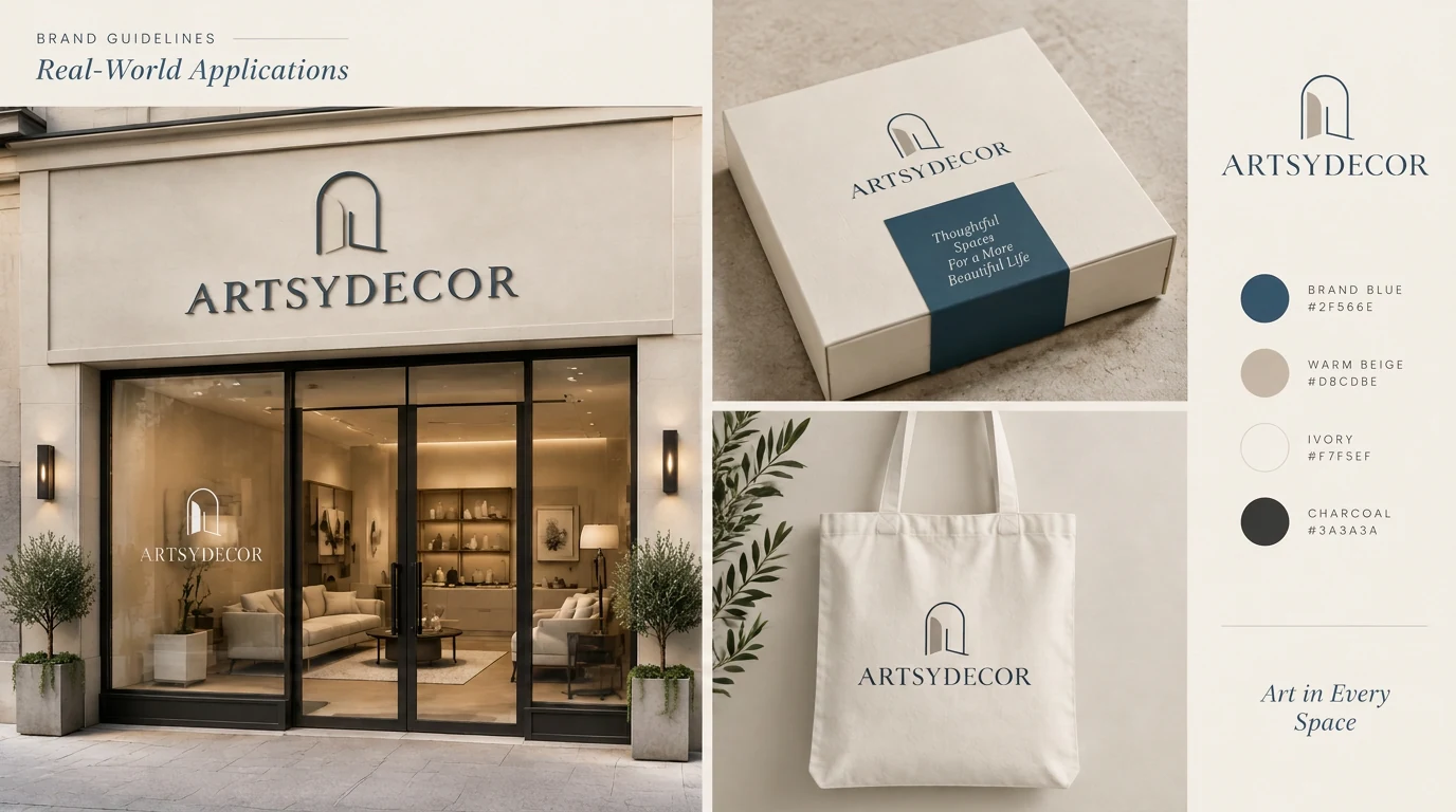
The mark moves from a storefront sign to packaging and a fabric tote, carrying the same calm architectural character.
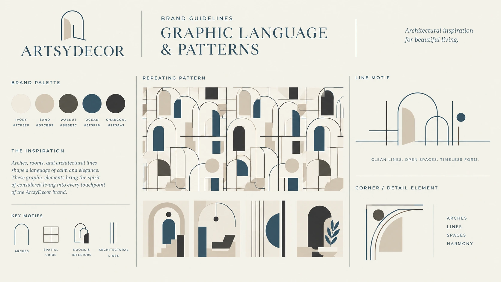
Repeating forms, line motifs and interior-inspired details extend the symbol into a flexible graphic system.
The arch and wordmark shift into a soft champagne tone for a more intimate, evening expression.
The black-on-white version keeps the architectural idea and typographic detail clear in simple print use.
A white mark on deep navy offers a crisp alternative for dark surfaces and digital backgrounds.
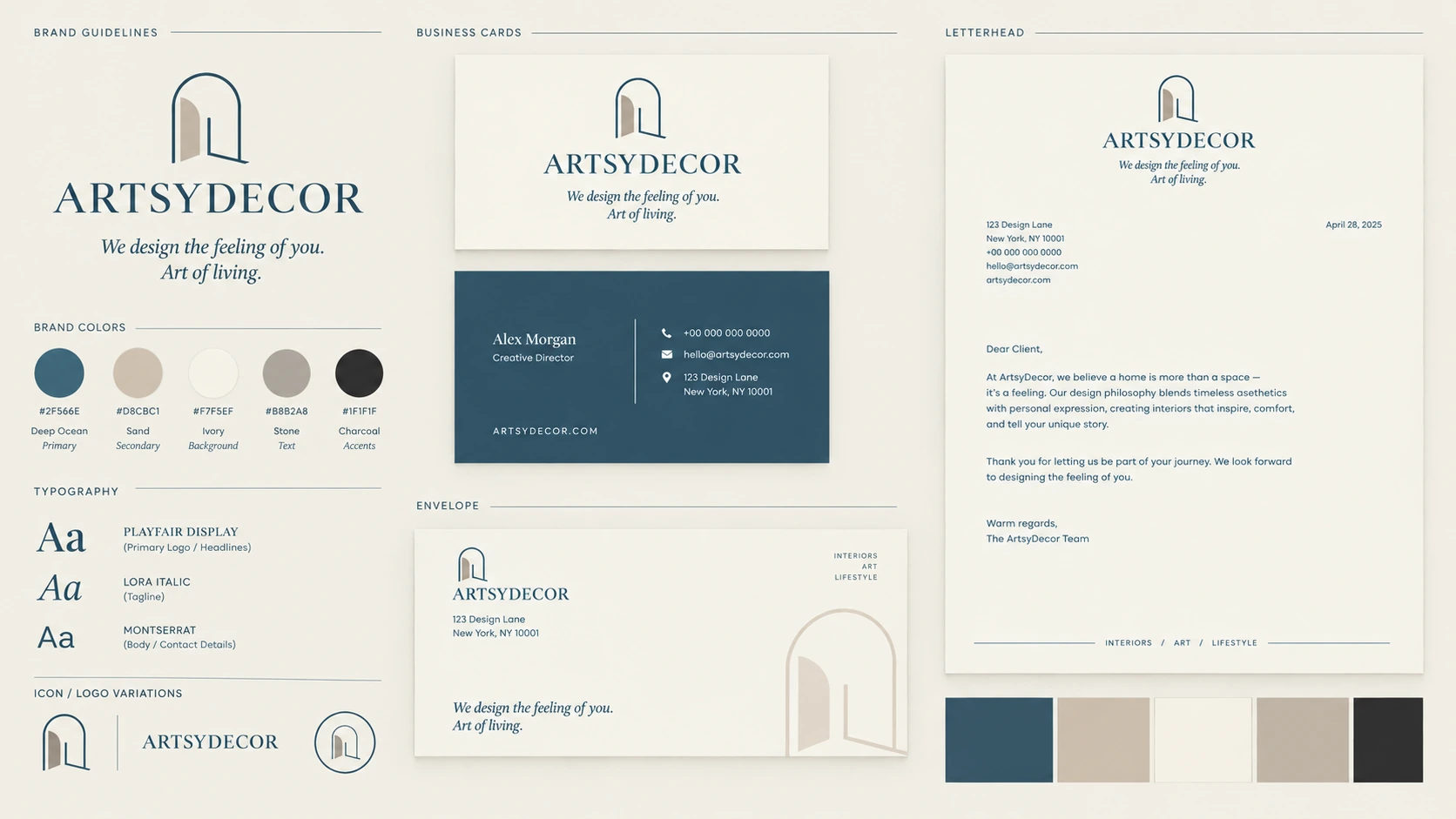
Business cards, letterhead and envelopes combine the wordmark, arch and color palette in everyday materials.
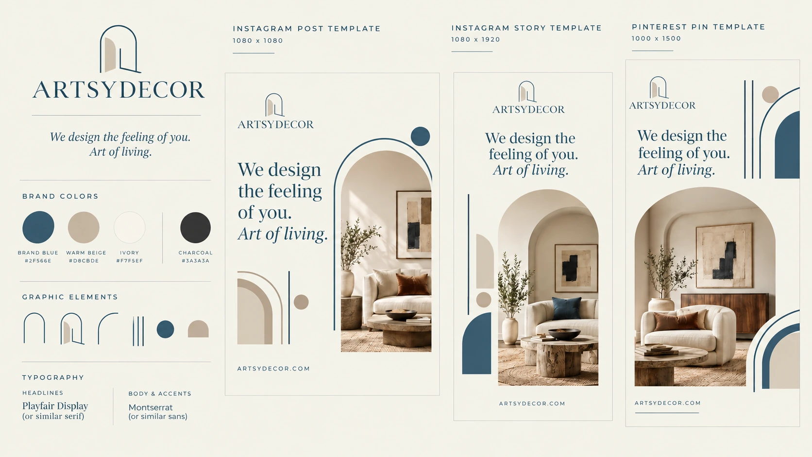
Post and story templates place the identity around interior imagery and the Art of living message.
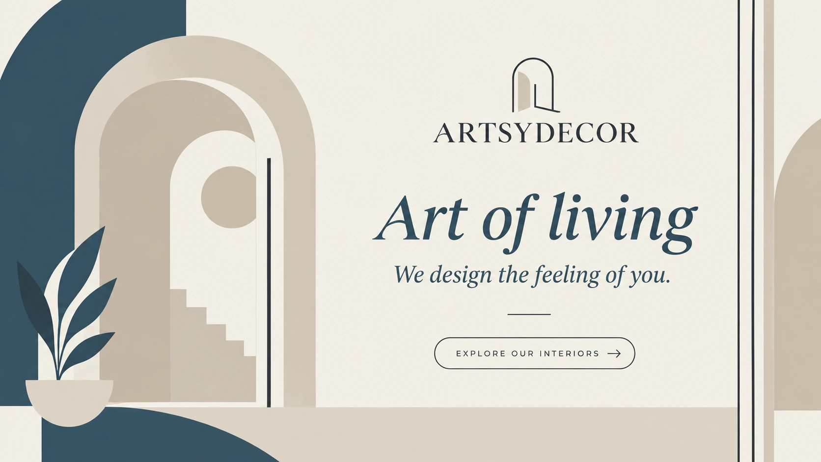
The poster uses the arch as an illustrated scene with a clear headline and call to action.
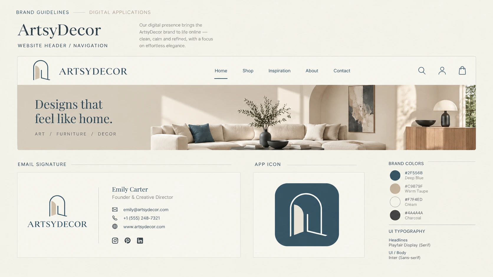
Website, email and app icon treatments carry the identity into digital touchpoints.
The creative idea
ONE MARK
MANY SPACES
The arch suggests an opening into a room and grows into patterns, illustrations and layouts. An elegant serif and a palette of ivory, slate navy and warm neutrals connect the storefront, stationery, social templates, poster and web applications.