
OUTSET
OUTSET brings destinations, daily plans, budgets and group decisions into one travel-planning experience across desktop and mobile.
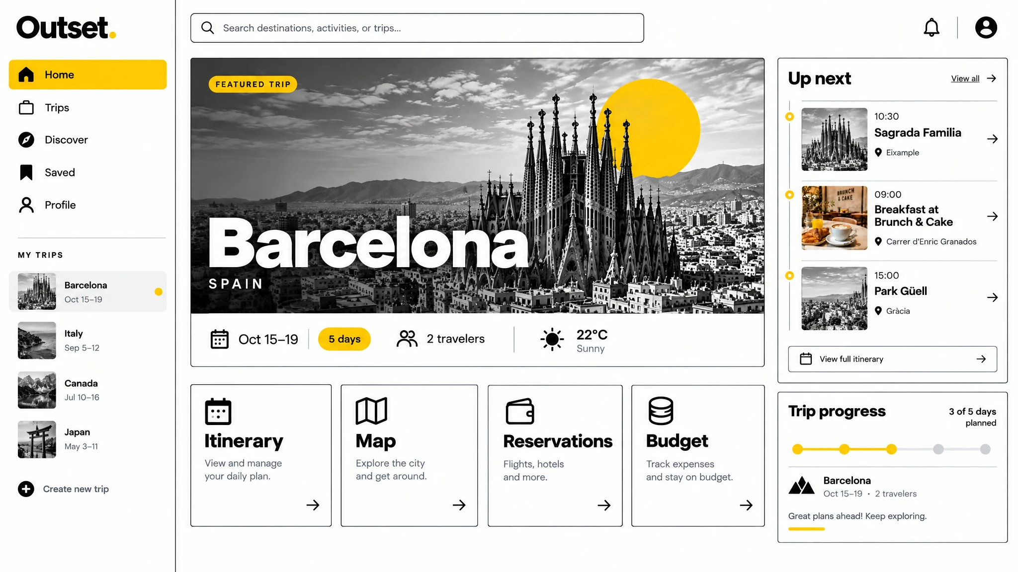
Product Design · UI/UX · Responsive Web · Mobile Experience
Planning a group trip can scatter places, timings, expenses and decisions across separate conversations and tools. The product needed a clear structure that keeps the trip understandable as the plan changes.
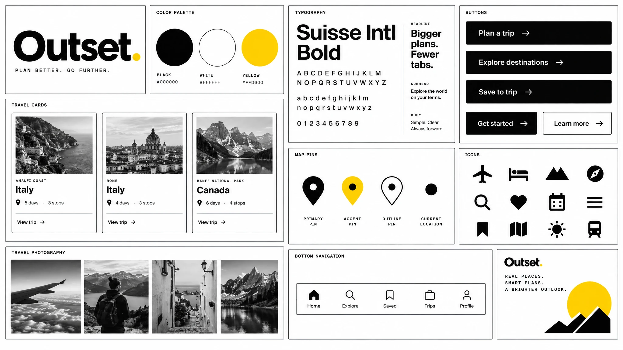
Black, white and a focused yellow accent define the final interface language across navigation, controls and trip content.
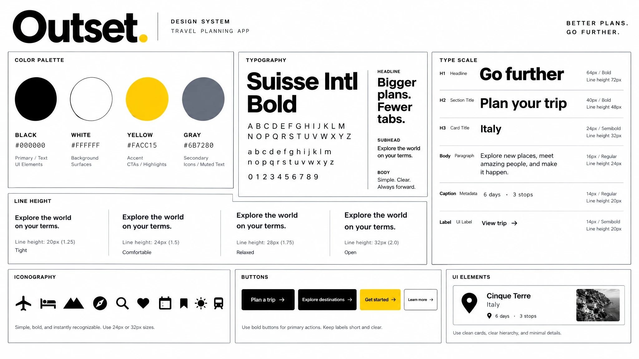
The color palette, typography, type scale and interface elements give Outset a consistent visual language.
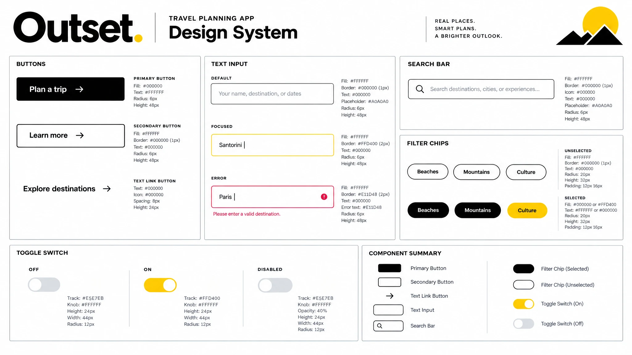
Buttons, inputs, search, filters and mobile switches are designed as a connected set of reusable controls.
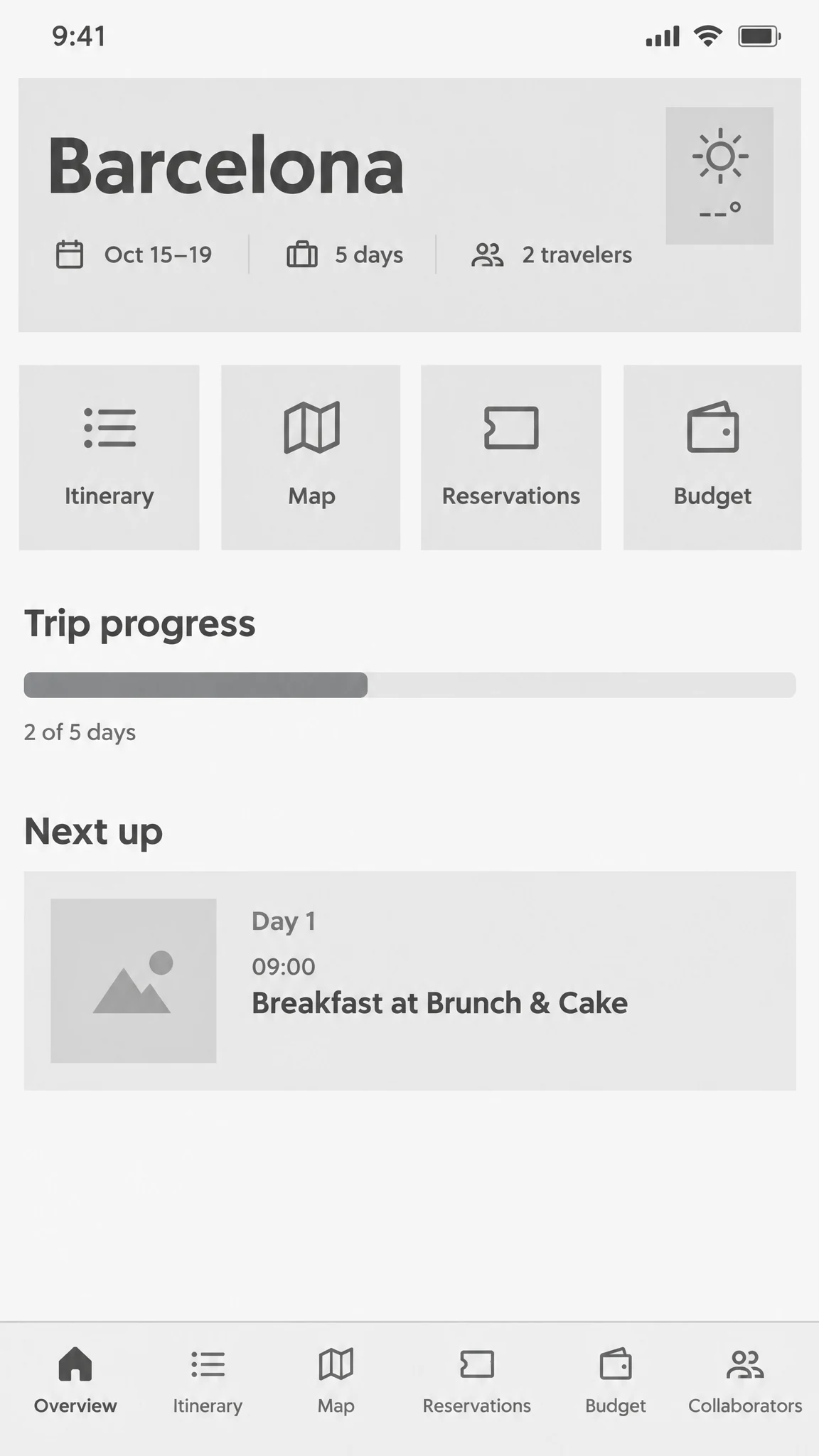
The overview wireframe establishes the trip's key destinations: itinerary, map, reservations and budget.
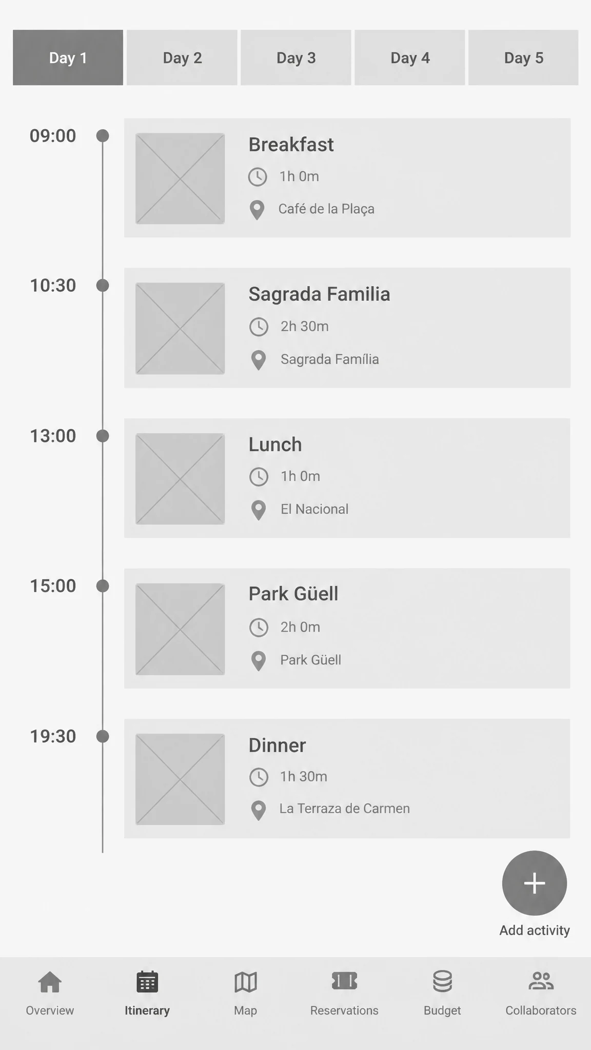
The itinerary wireframe tests a simple sequence of activities with a clear action to add another stop.
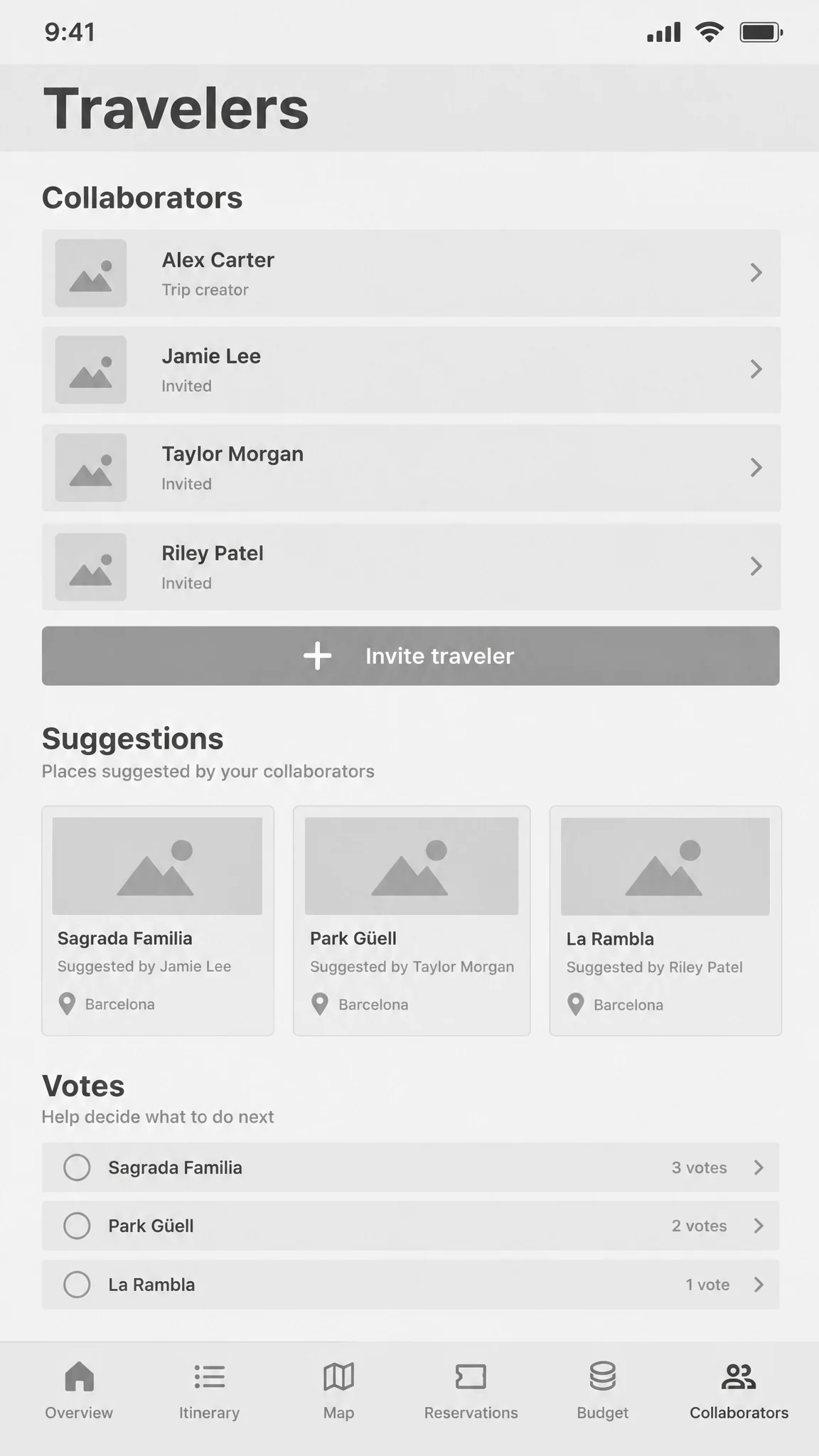
The collaboration wireframe brings travelers, suggestions and voting into the same trip context.
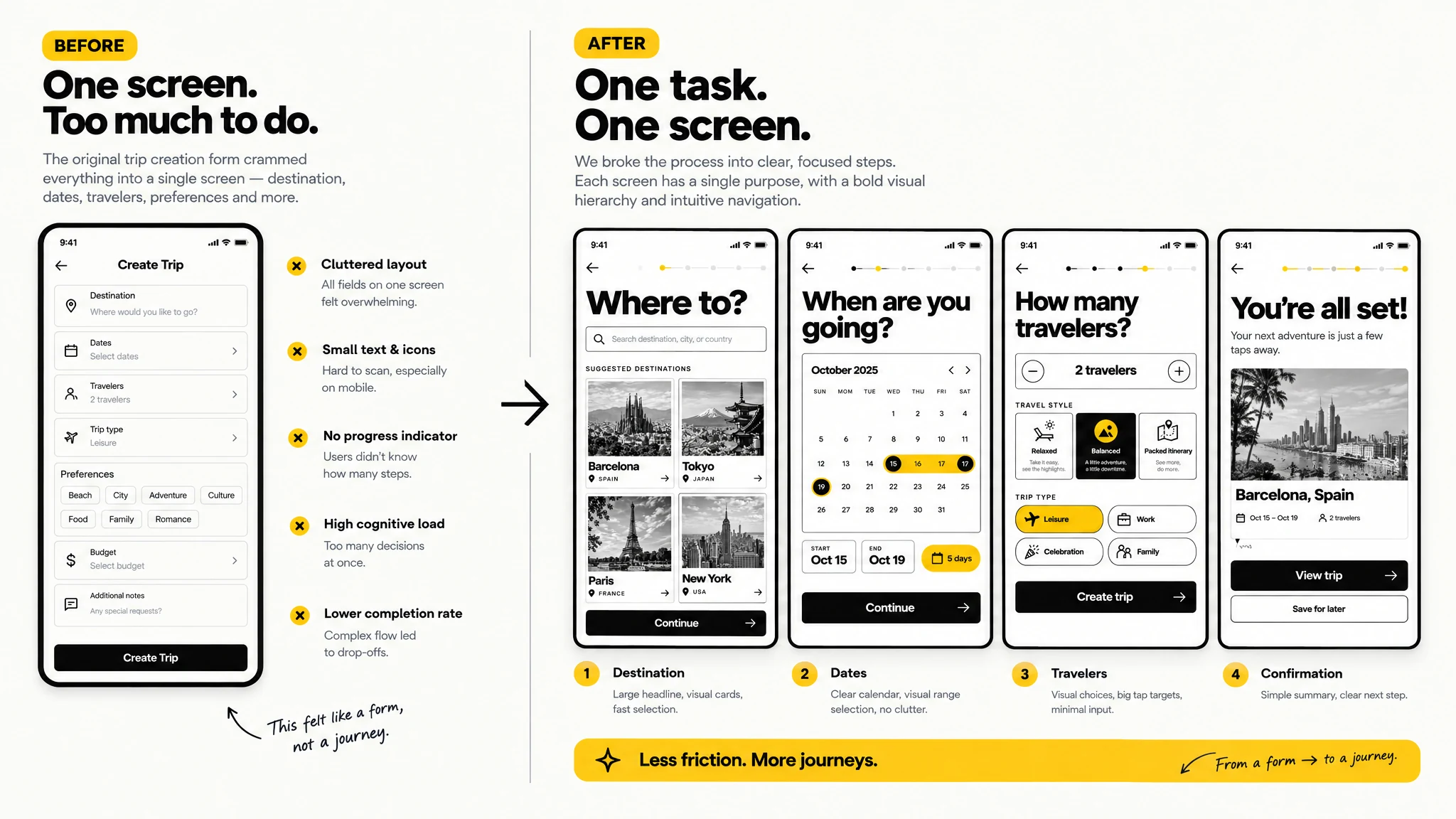
A before-and-after comparison shows how one crowded form became focused steps for destination, dates and travelers.
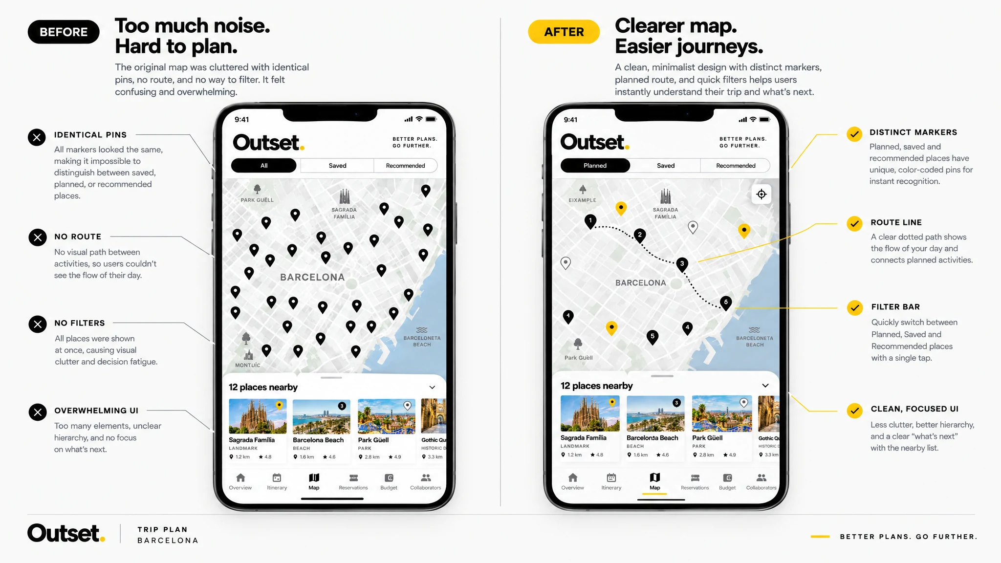
The refined map removes visual noise and gives the route, selected places and planning actions a clearer hierarchy.
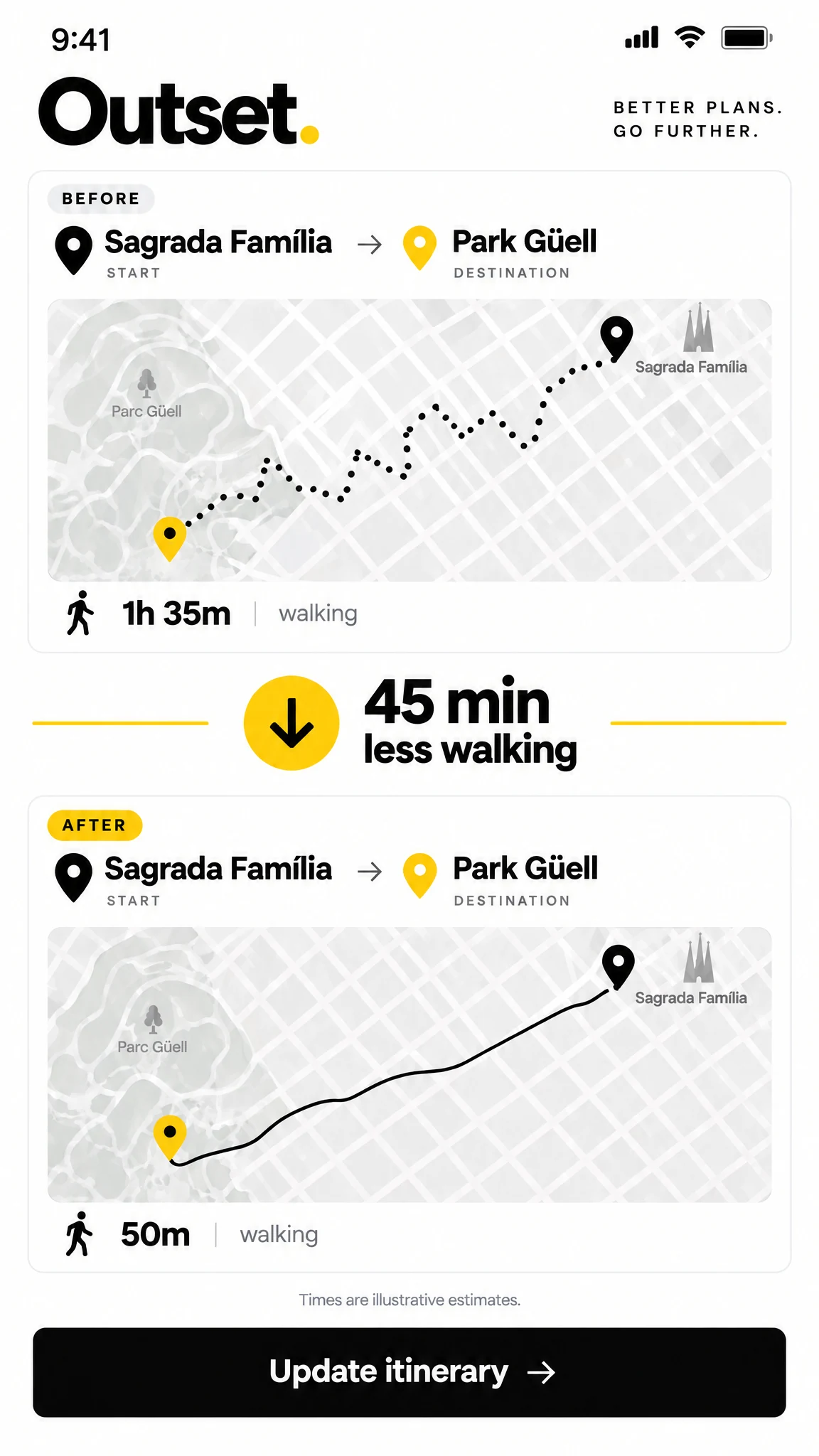
The before-and-after view makes a shorter walking route and its travel-time saving easy to compare.
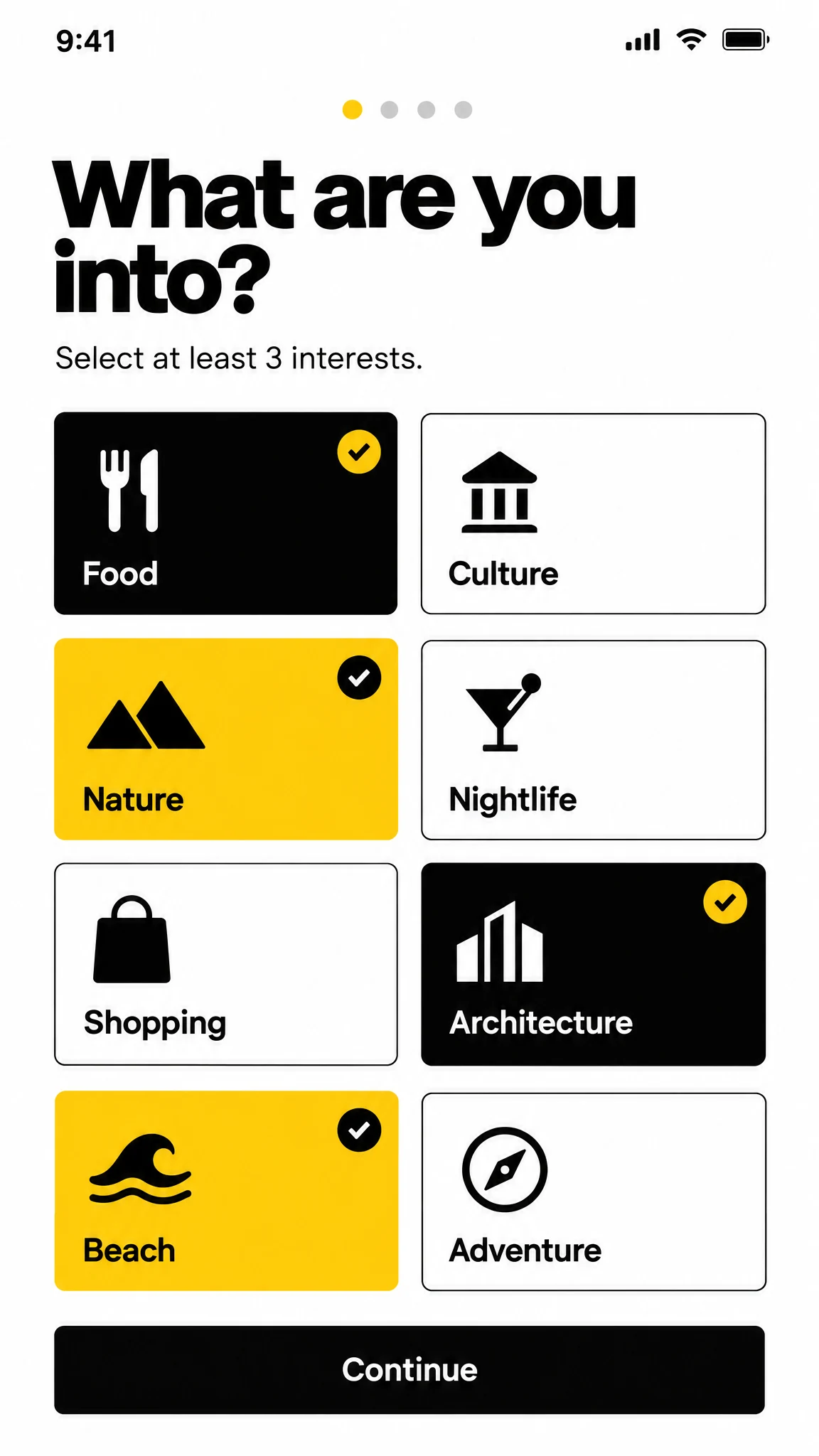
Travelers select their interests through a compact set of clear, tappable choices before planning their first trip.
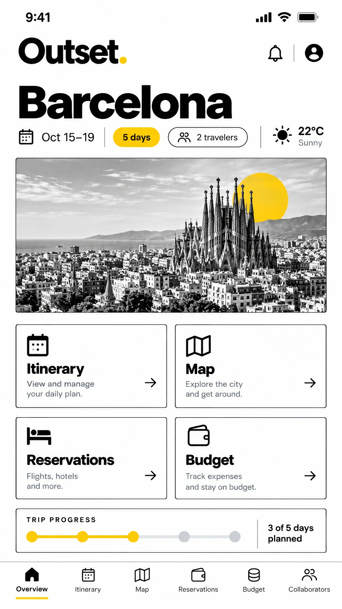
The final mobile view keeps dates, weather, progress and the main planning areas in a compact, scannable layout.
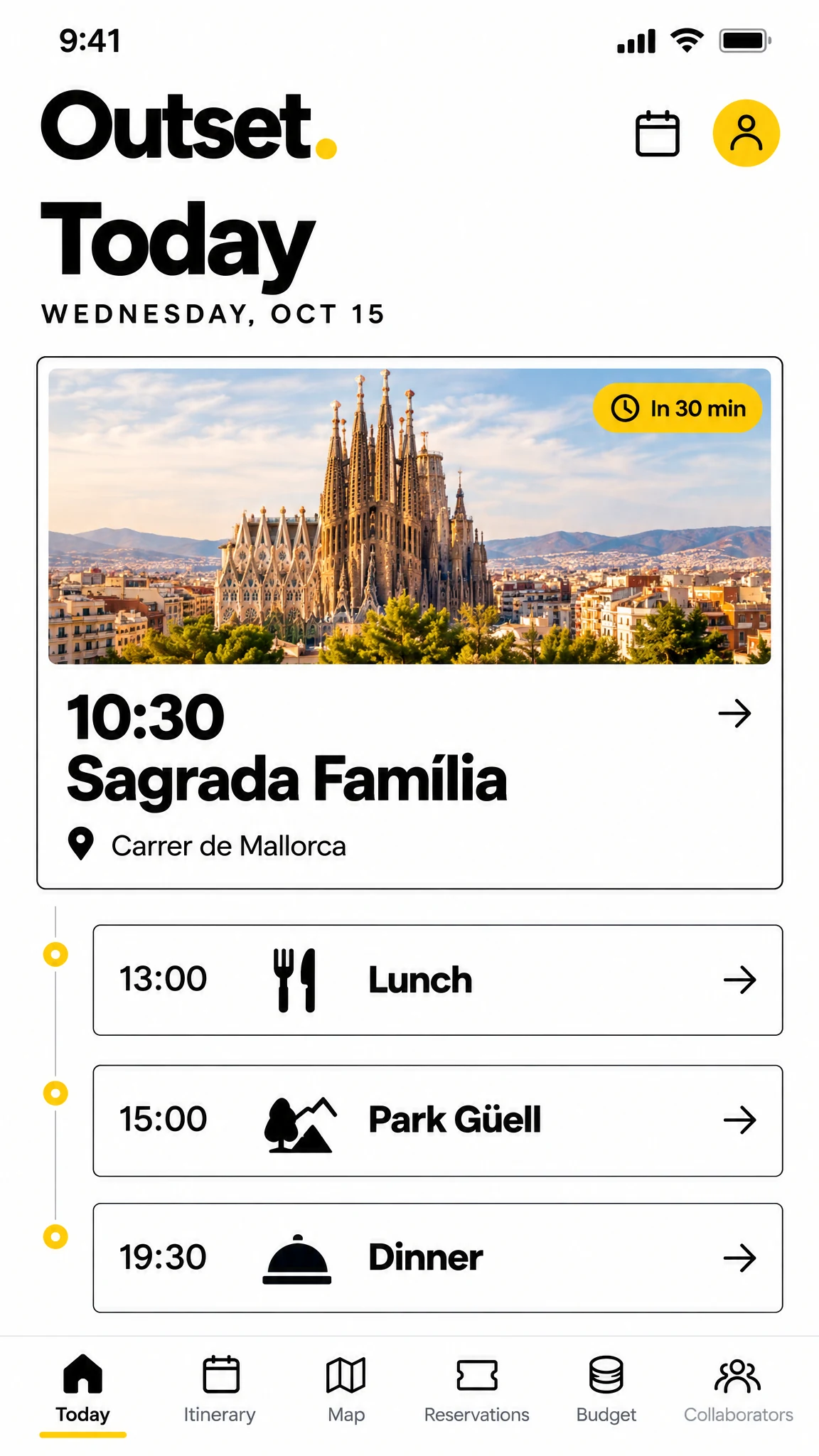
The live day view highlights the next stop and keeps the rest of the itinerary close at hand.
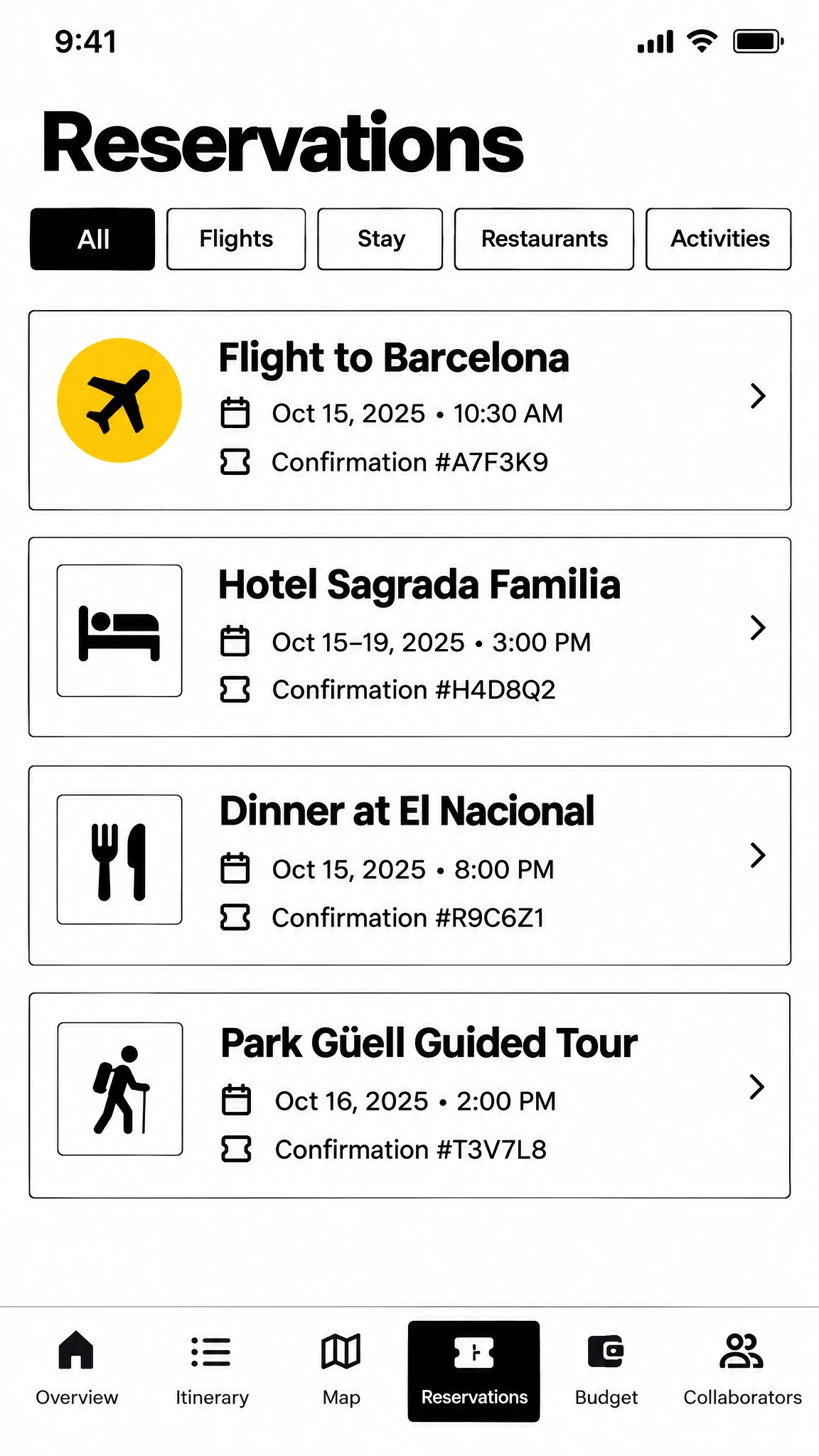
Flights, stays, meals and activities appear together with their key dates and confirmation details.
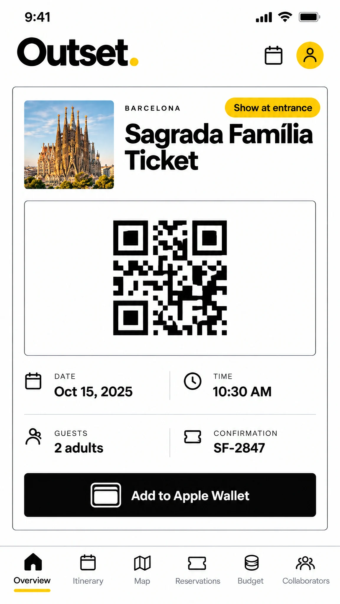
A dedicated ticket screen puts the reservation code, timing and travelers together when they are needed.
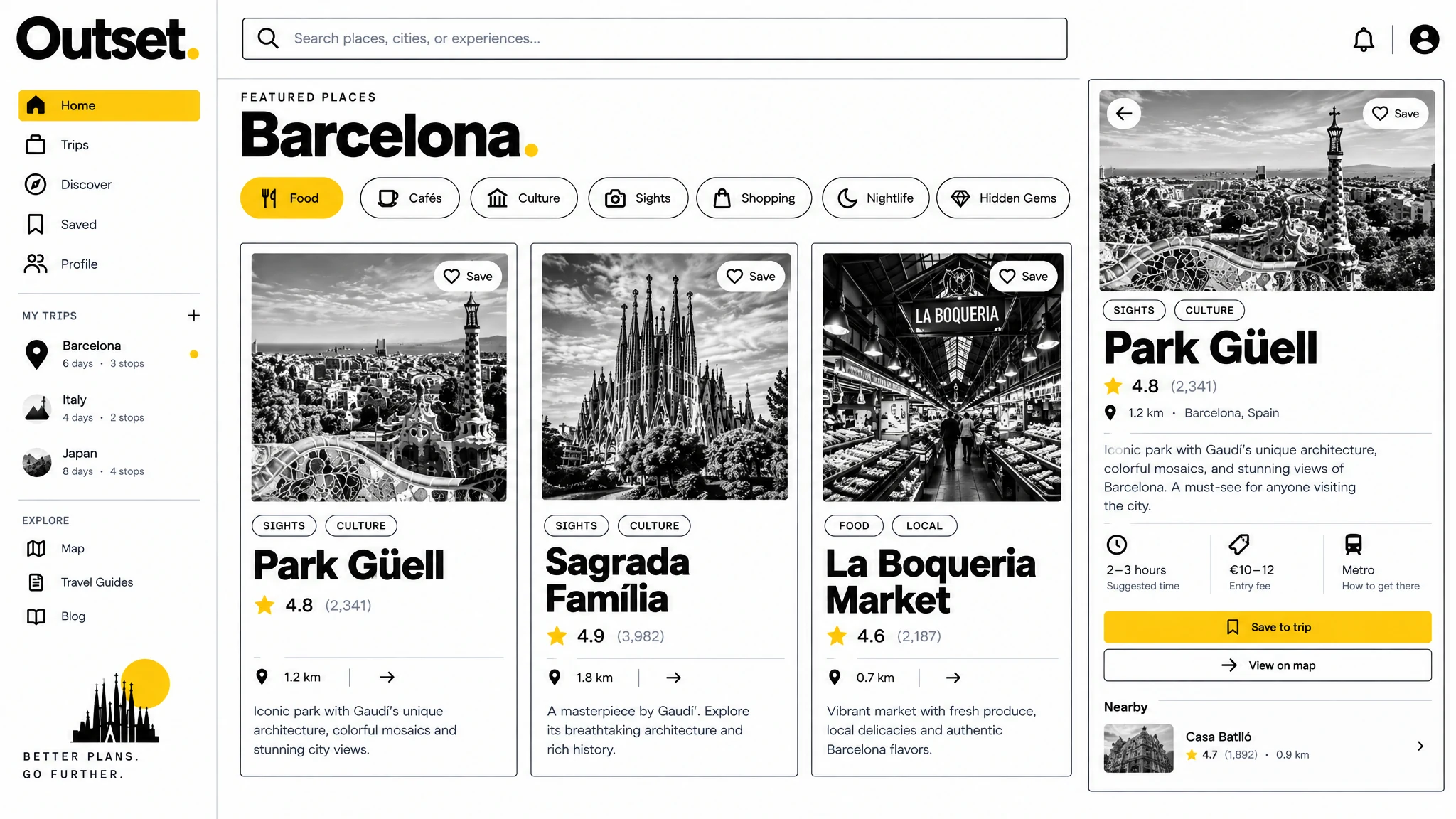
The discovery view brings categories, place cards, a map preview and a clear save action together in one workspace.
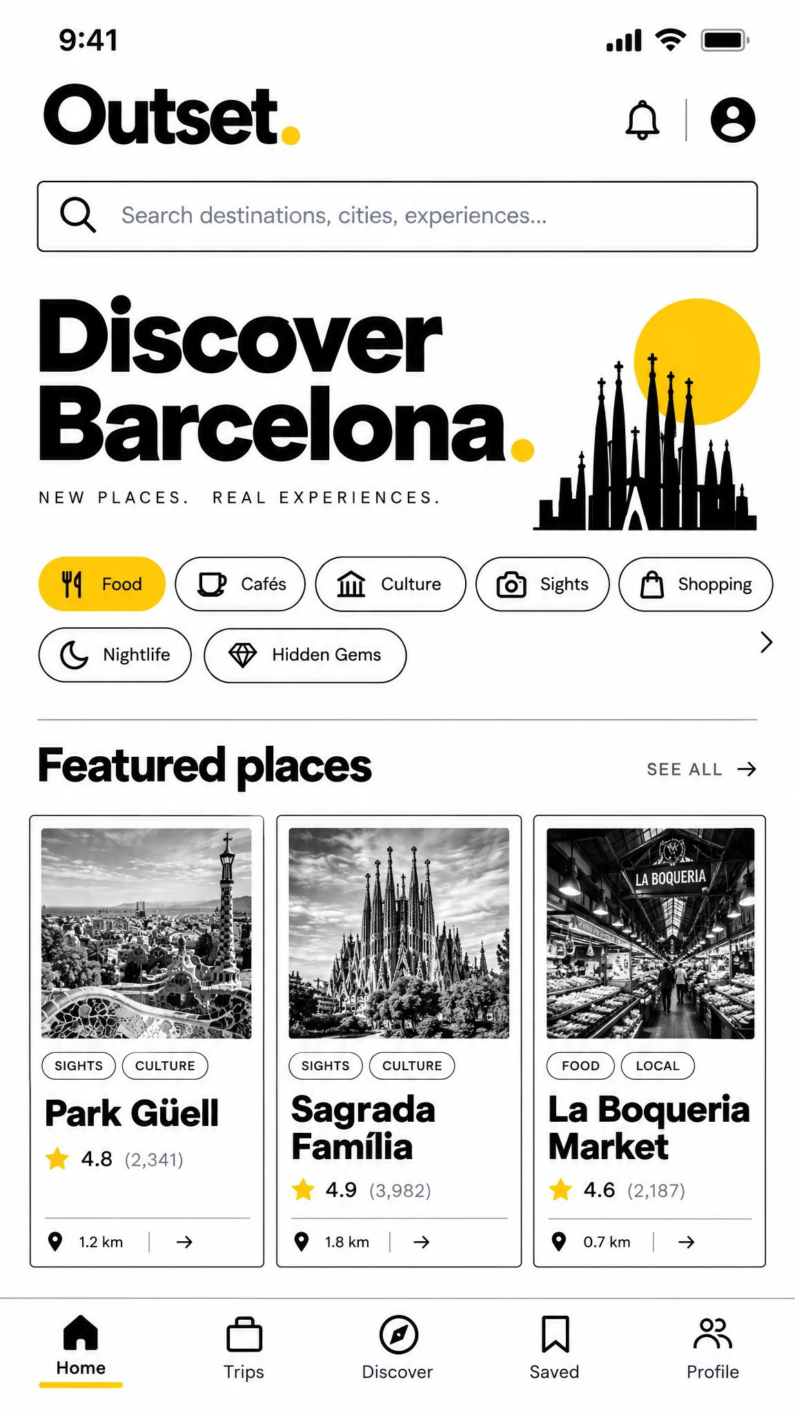
Featured Barcelona places and useful filters make browsing easy from a small screen.
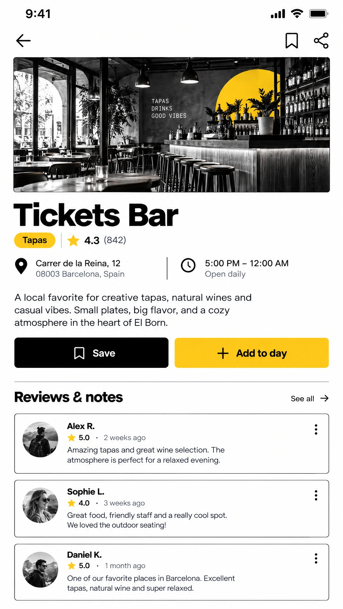
Photos, ratings, practical details and traveler notes help turn a discovery into an informed decision.
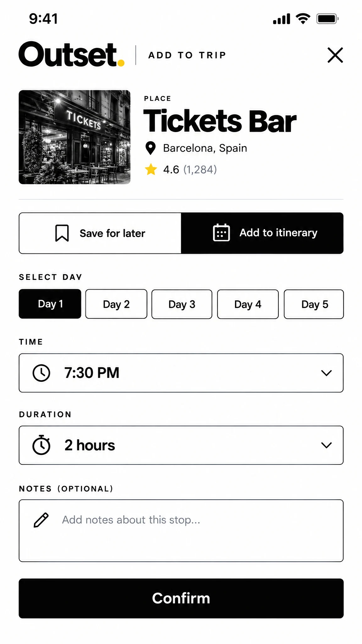
A focused panel lets travelers choose a day, time and duration before adding a saved place to the itinerary.
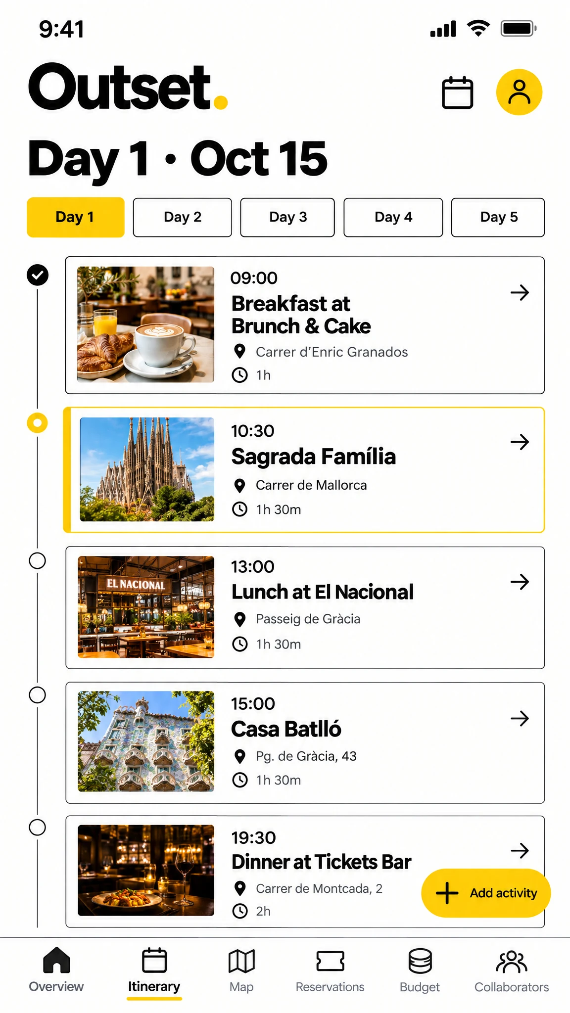
Activities appear in time order with imagery, key details and a direct way to add another stop.
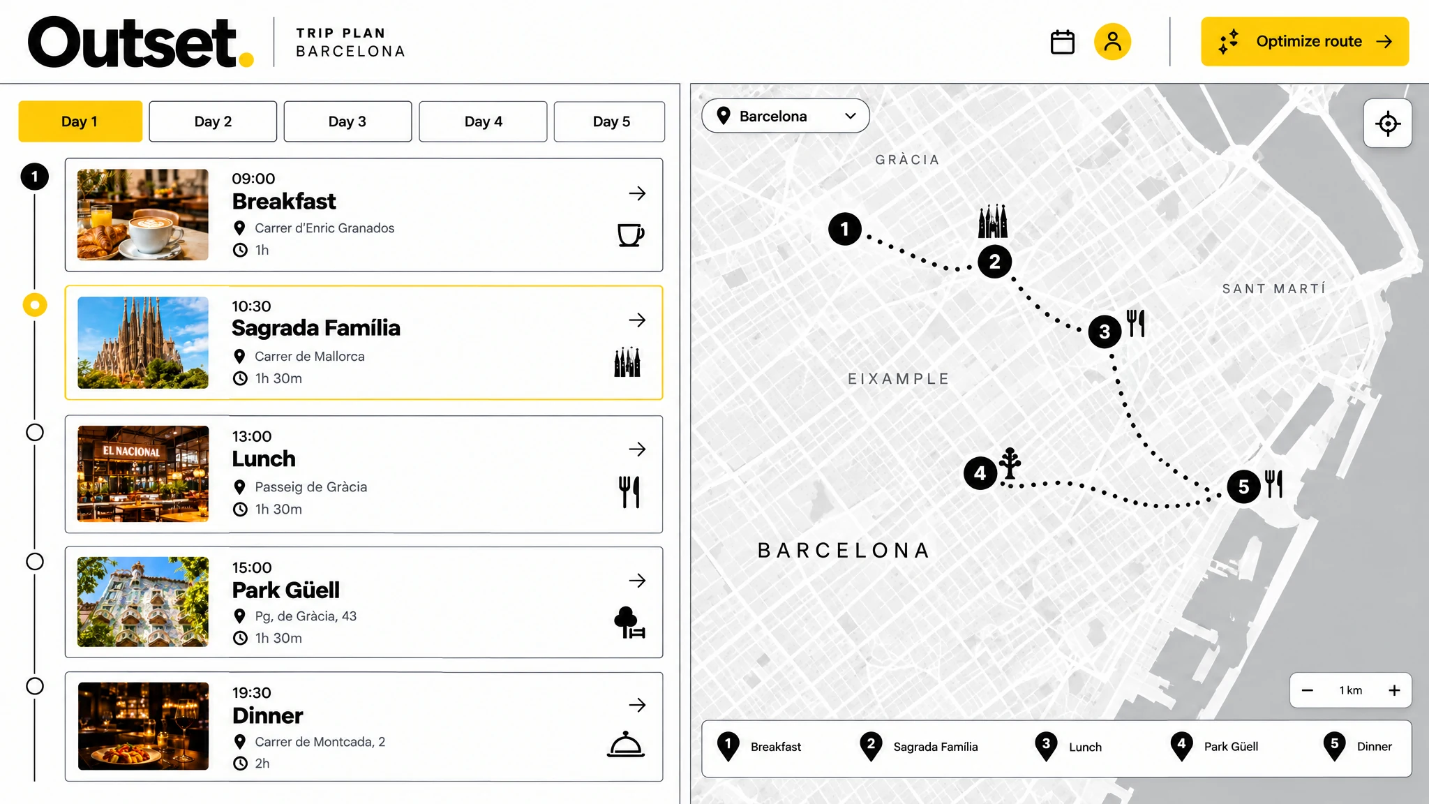
Desktop connects the day's sequence to locations on a map, making travel time and nearby stops easier to understand.
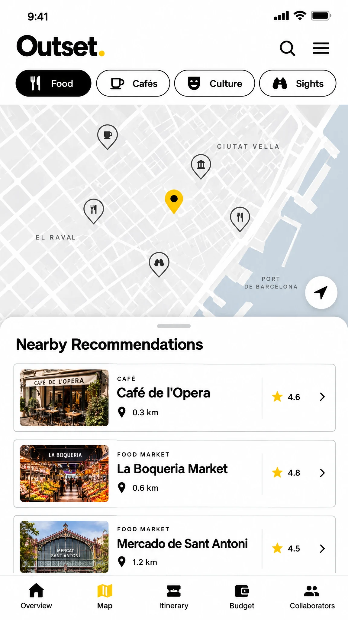
Map filters and a compact recommendation list surface relevant places close to the day's plan.
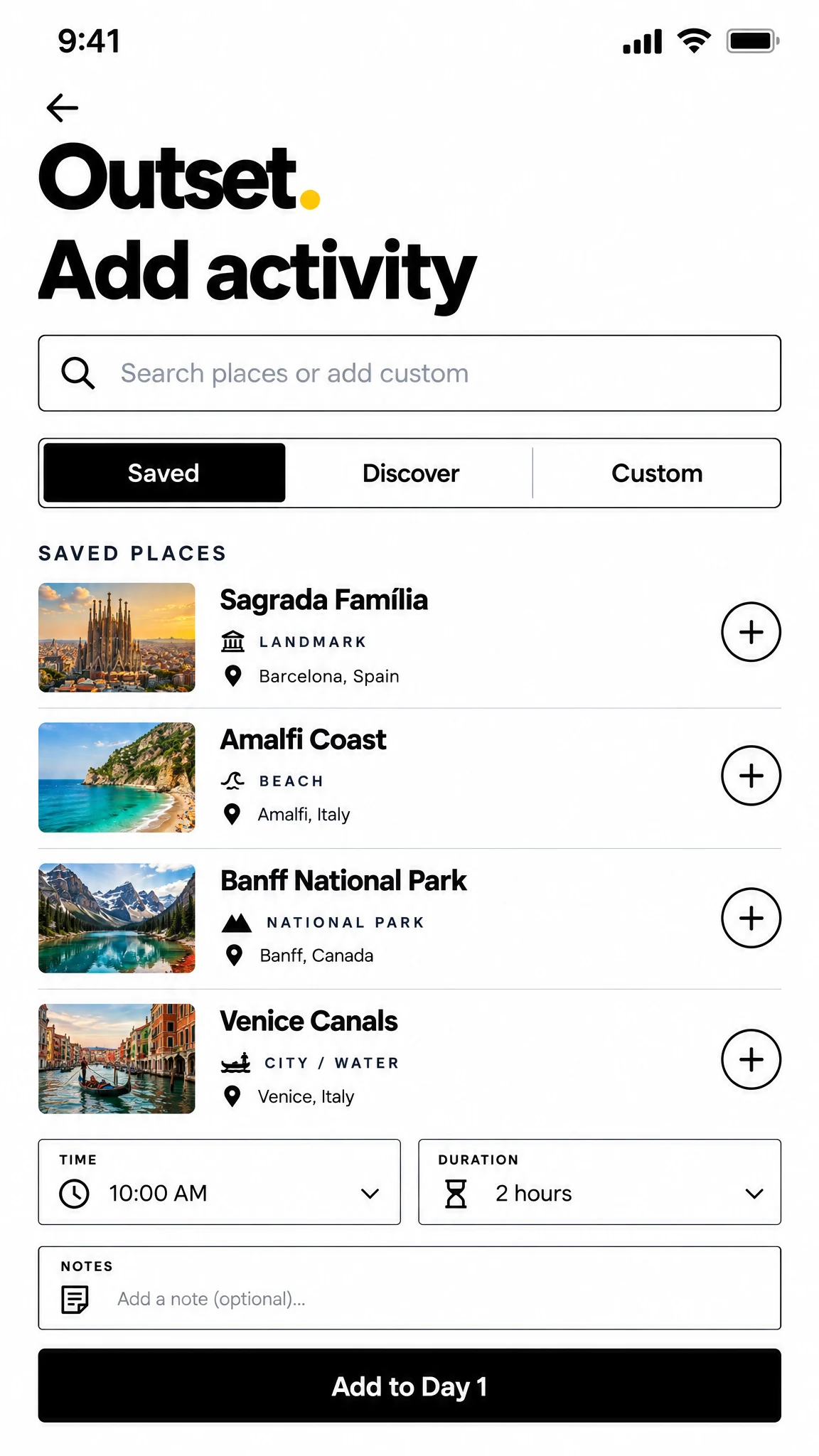
Search, saved places and time details guide the user from a new idea into the itinerary.
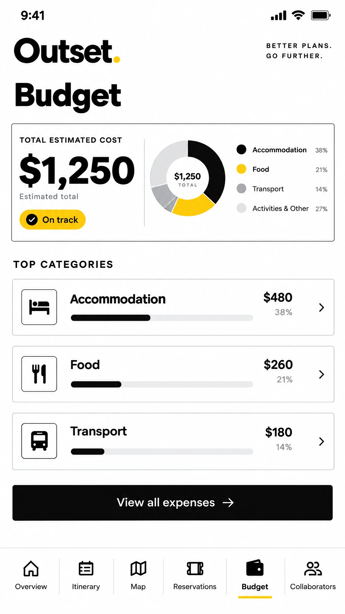
The budget overview shows total spend, remaining budget and category breakdown without losing the trip context.
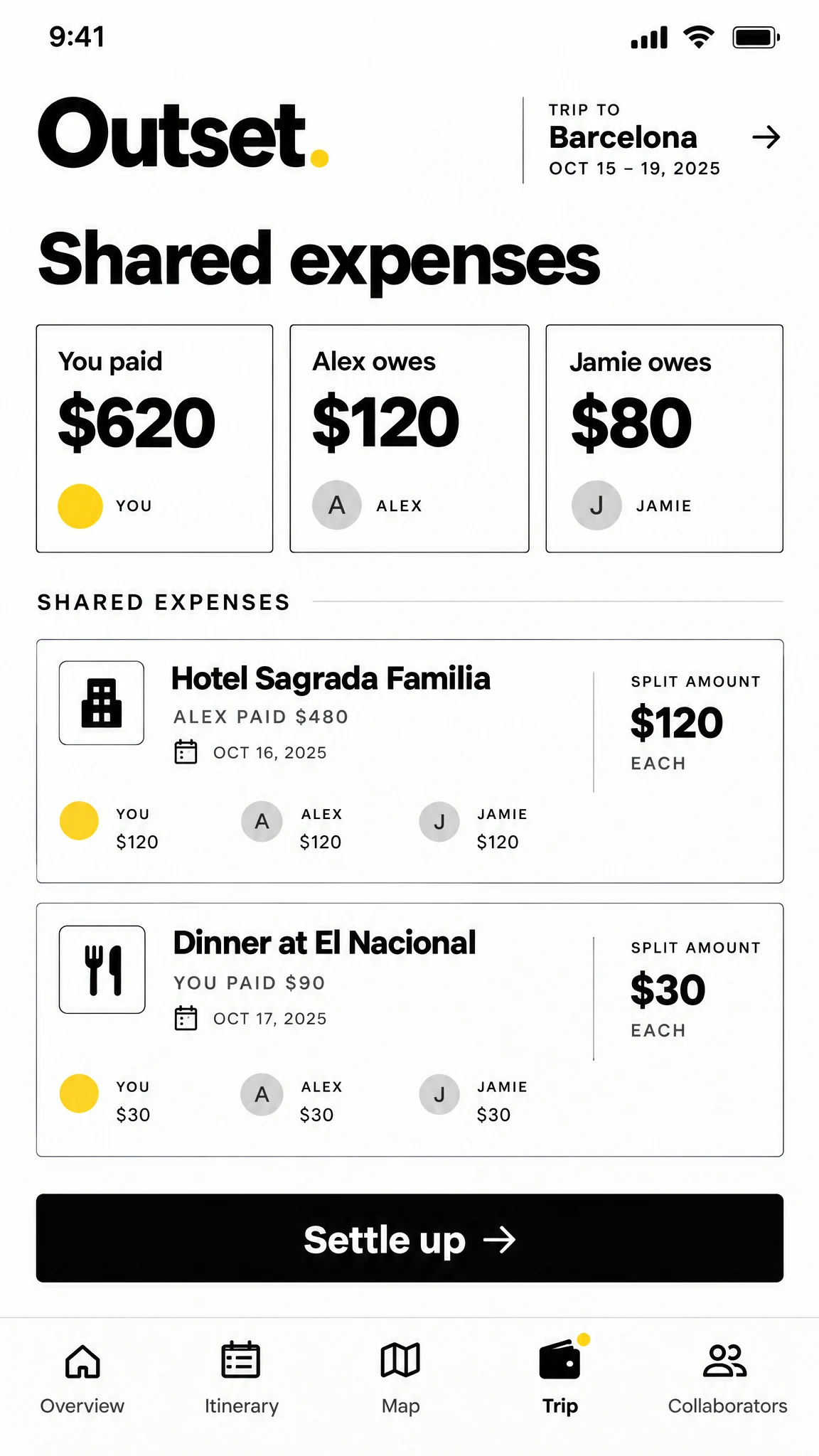
Individual balances and expense entries make it easier to see what each traveler paid or owes.
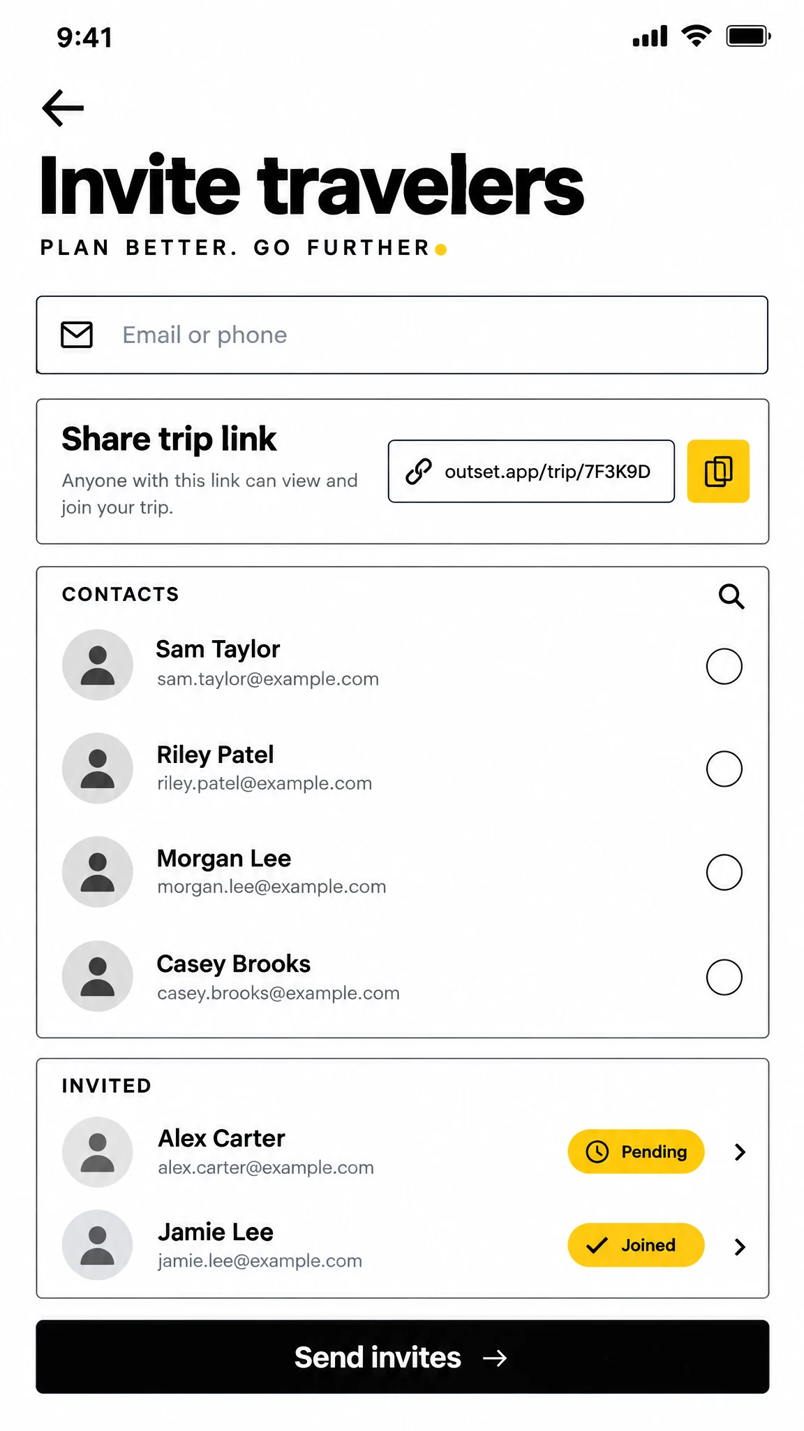
The invitation screen supports a trip link and direct invites, while showing who has joined.
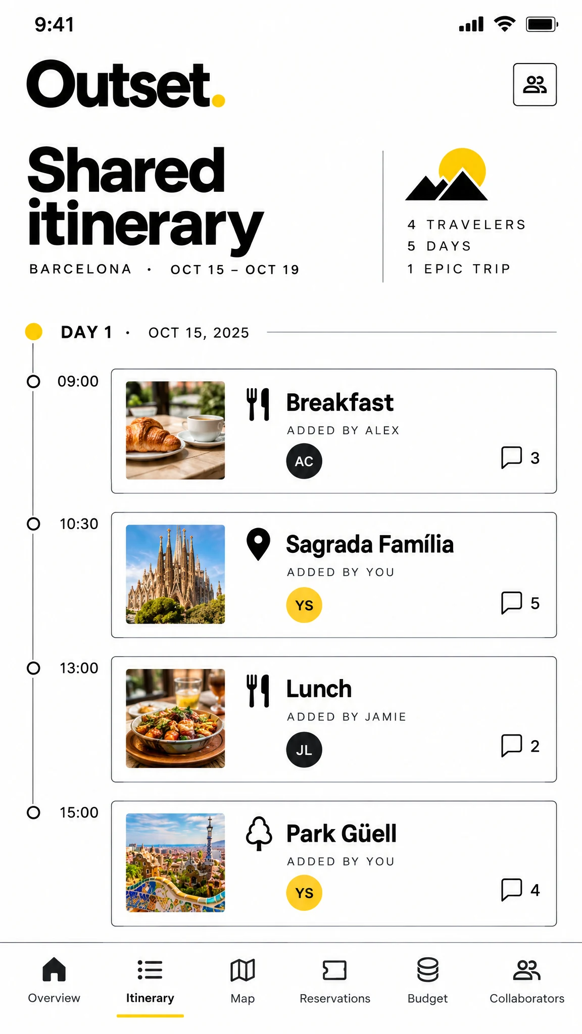
The same day plan becomes a shared space where travelers can follow the route and discuss activities.
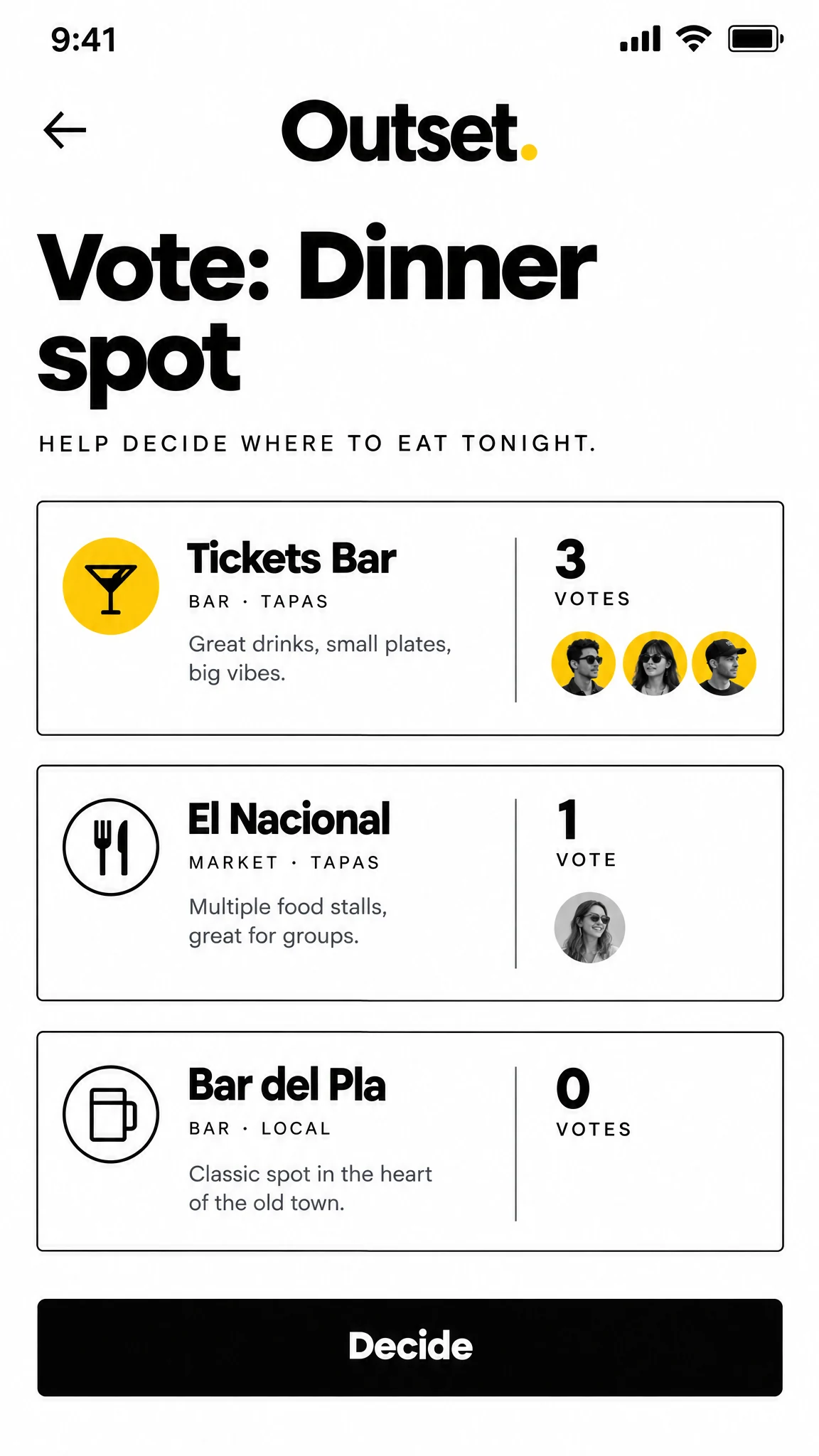
A simple vote turns competing dinner ideas into a visible group decision.
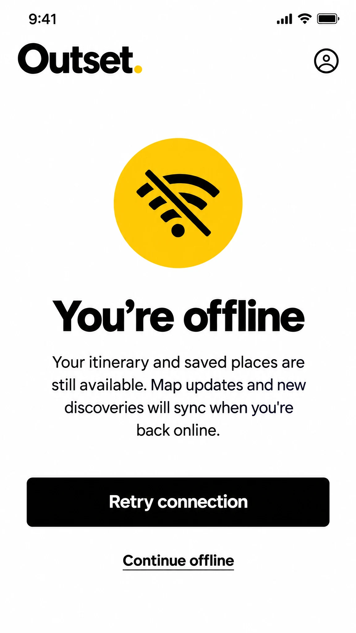
The offline state explains what remains available and gives travelers a clear way to continue or retry.
The product idea
ONE CONNECTED PLAN
FROM IDEA TO ITINERARY
A black-and-white interface with focused yellow signals creates a consistent hierarchy across discovery, itinerary, map, budget and collaboration. Each screen keeps the next action visible, from adding a place to sharing a plan and deciding together.